How do I evenly add space between a label and the input field regardless of length of text?
2019 answer:
Some time has passed and I changed my approach now when building forms. I've done thousands of them till today and got really tired of typing id for every label/input pair, so this was flushed down the toilet. When you dive input right into the label, things work the same way, no ids necessary. I also took advantage of flexbox being, well, very flexible.
HTML:
<label>
  Short label <input type="text" name="dummy1" />
</label>

<label>
  Somehow longer label <input type="text" name="dummy2" />
</label>

<label>
  Very long label for testing purposes <input type="text" name="dummy3" />
</label>
CSS:
label {
  display: flex;
  flex-direction: row;
  justify-content: flex-end;
  text-align: right;
  width: 400px;
  line-height: 26px;
  margin-bottom: 10px;
}

input {
  height: 20px;
  flex: 0 0 200px;
  margin-left: 10px;
}
Fiddle DEMO
Original answer:
Use label instead of span. It's meant to be paired with inputs and preserves some additional functionality (clicking label focuses the input).
This might be exactly what you want:
HTML:
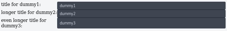
<label for="dummy1">title for dummy1:</label>
<input id="dummy1" name="dummy1" value="dummy1">

<label for="dummy2">longer title for dummy2:</label>
<input id="dummy2" name="dummy2" value="dummy2">

<label for="dummy3">even longer title for dummy3:</label>
<input id="dummy3" name="dummy3" value="dummy3">
CSS:
label {
    width:180px;
    clear:left;
    text-align:right;
    padding-right:10px;
}

input, label {
    float:left;
}
jsfiddle DEMO here.
This can be accomplished using the brand new CSS display: grid (browser support)
HTML:
<div class='container'>
  <label for="dummy1">title for dummy1:</label>
  <input id="dummy1" name="dummy1" value="dummy1">
  <label for="dummy2">longer title for dummy2:</label>
  <input id="dummy2" name="dummy2" value="dummy2">
  <label for="dummy3">even longer title for dummy3:</label>
  <input id="dummy3" name="dummy3" value="dummy3">
</div>
CSS:
.container {
  display: grid;
  grid-template-columns: 1fr 3fr;
}
When using css grid, by default elements are laid out column by column then row by row. The grid-template-columns rule creates two grid columns, one which takes up 1/4 of the total horizontal space and the other which takes up 3/4 of the horizontal space. This creates the desired effect.
JS-FIDDLE
You can use a table
<table class="formcontrols" >
    <tr>
        <td>
            <label for="firstName">FirstName:</label>
        </td>
        <td  style="padding-left:10px;">
            <input id="firstName" name="firstName" value="John">
        </td>
    </tr>
    <tr>
        <td>
            <label for="Test">Last name:</label>
        </td>
        <td  style="padding-left:10px;">
            <input id="lastName" name="lastName" value="Travolta">
        </td>
    </tr>
</table>
The result would be: ImageResult