How do I easily support light and dark mode with a custom color used in my app?
Here I got this helper method to create dynamic colors:
extension UIColor {
    static func dynamicColor(light: UIColor, dark: UIColor) -> UIColor {
        guard #available(iOS 13.0, *) else { return light }
        return UIColor { $0.userInterfaceStyle == .dark ? dark : light }
    }
}
And for the solution in the question, the helper method should be used as the following:
extension UIColor {
    static let myControlBackground: UIColor = dynamicColor(light: UIColor(red: 0.3, green: 0.4, blue: 0.5, alpha: 1), dark: UIColor(red: 0.4, green: 0.3, blue: 0.2, alpha: 1))
}
No need to override traitCollectionDidChange, just set the backgroundColor once and you are done.
In case you are want to create dynamic colours programmatically:
Reusable extension:
extension UIColor {

   public class func dynamicColor(light: UIColor, dark: UIColor) -> UIColor {
      if #available(iOS 13.0, *) {
         return UIColor {
            switch $0.userInterfaceStyle {
            case .dark:
               return dark
            default:
               return light
            }
         }
      } else {
         return light
      }
   }
}
App Colors:
struct MyColors {

   ///> This is what you are getting from designers,
   /// in case they are not providing consistent color naming.
   /// Can be also just strings with HEX-codes.
   static let xF9EFB1 = #colorLiteral(red: 0.9764705882352941, green: 0.9372549019607843, blue: 0.6941176470588235, alpha: 1)
   static let x6A6A6A = #colorLiteral(red: 0.4156862745098039, green: 0.4156862745098039, blue: 0.4156862745098039, alpha: 1)
   static let xFEFEFE = #colorLiteral(red: 0.9960784313725490, green: 0.9960784313725490, blue: 0.9960784313725490, alpha: 1)
   static let x202020 = #colorLiteral(red: 0.1254901960784314, green: 0.1254901960784314, blue: 0.1254901960784314, alpha: 1)
   ///<

   static var myLabelForeground: UIColor {
      return UIColor.dynamicColor(light: MyColors.x6A6A6A, dark: MyColors.xF9EFB1)
   }

   static var myViewBackground: UIColor {
      return UIColor.dynamicColor(light: MyColors.xFEFEFE, dark: MyColors.x202020)
   }
}
Usage:
class SampleView: View {

   private lazy var label = Label(text: "Hello!")

   override func setupUI() {
      label.textColor = MyColors.myLabelForeground
      label.font = UIFont.systemFont(ofSize: 24, weight: .semibold)
      backgroundColor = MyColors.myViewBackground
      addSubview(label)
      LayoutConstraint.centerXY(label).activate()
   }

}
Result:


UPDATE: NSColor extension:
import AppKit

extension NSColor {

   public class func dynamicColor(light: NSColor, dark: NSColor) -> NSColor {
      if #available(OSX 10.15, *) {
         return NSColor(name: nil) {
            switch $0.name {
            case .darkAqua, .vibrantDark, .accessibilityHighContrastDarkAqua, .accessibilityHighContrastVibrantDark:
               return dark
            default:
               return light
            }
         }
      } else {
        return light
      }
   }
}
Another solution with iOS 13 is to define custom colors in your asset catalog using Xcode’s asset editor.
As mentioned in the documentation, when you need a specific color, create it as a color asset. In your asset, specify different color values for both light and dark appearances. You can also specify high-contrast versions of your colors.
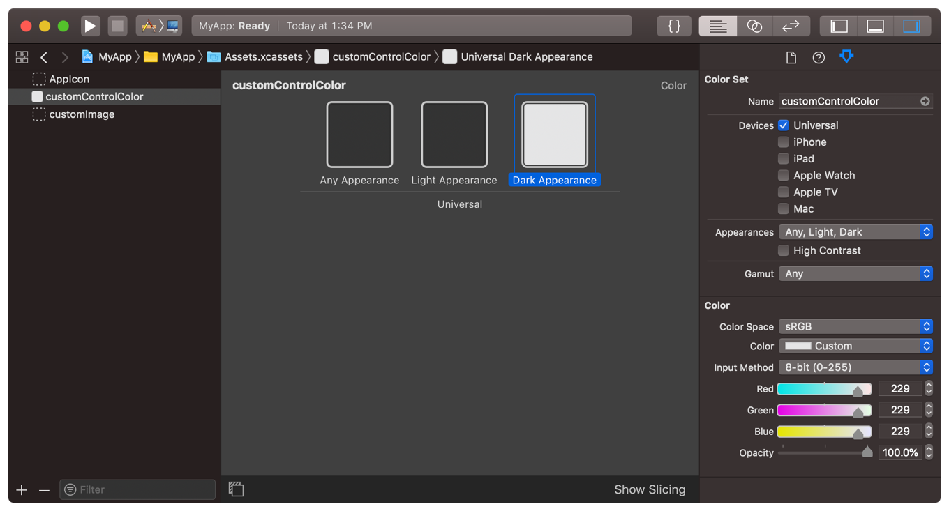
Note that Any Appearance variant is the color that is displayed on older systems that do not support Dark Mode.
To load a color value from an asset catalog, you can load the color by its name:
// iOS
let aColor = UIColor(named: "customControlColor")

// macOS
let aColor = NSColor(named: NSColor.Name("customControlColor"))
Now anytime user switches between dark and light mode, the specified colors will dynamically change through the app.
As it turns out, this is really easy with the new UIColor init(dynamicProvider:) initializer.
Update the custom color to:
extension UIColor {
    static var myControlBackground: UIColor {
        if #available(iOS 13.0, *) {
            return UIColor { (traits) -> UIColor in
                // Return one of two colors depending on light or dark mode
                return traits.userInterfaceStyle == .dark ?
                    UIColor(red: 0.5, green: 0.4, blue: 0.3, alpha: 1) :
                    UIColor(red: 0.3, green: 0.4, blue: 0.5, alpha: 1)
            }
        } else {
            // Same old color used for iOS 12 and earlier
            return UIColor(red: 0.3, green: 0.4, blue: 0.5, alpha: 1)
        }
    }
}
That's it. No need to define two separate statics. The control class doesn't need any changes from the original code. No need to override traitCollectionDidChange or anything else.
The nice thing about this is that you can see the color change in the app switcher immediately after changing the mode in the Settings app. And of course the color is up-to-date automatically when you go back to the app.
On a related note when supporting light and dark mode - Use as many of the provided colors from UIColor as possible. See the available dynamic colors from UI Elements and Standard Colors. And when you need your own app-specific colors to support both light and dark mode, use the code in this answer as an example.
In Objective-C, you can define your own dynamic colors with:
UIColor+MyApp.h:
@interface UIColor (MyApp)

@property (class, nonatomic, readonly) UIColor *myControlBackgroundColor;

@end
UIColor+MyApp.m:
+ (UIColor *)myControlBackgroundColor {
    if (@available(iOS 13.0, *)) {
        return [UIColor colorWithDynamicProvider:^UIColor * _Nonnull(UITraitCollection * _Nonnull traits) {
            return traits.userInterfaceStyle == UIUserInterfaceStyleDark ?
                [self colorWithRed:0.5 green:0.4 blue:0.2 alpha:1.0] :
                [self colorWithRed:0.3 green:0.4 blue:0.5 alpha:1.0];
        }];
    } else {
        return [self colorWithRed:0.3 green:0.4 blue:0.5 alpha:1.0];
    }
}