How can I simplify my toolbar interface as the list of commands grows?
If you read Jef (and Aza) Raskin, you'll probably realize that icons are also not a good solution – both were pretty vocal in their dislike for them (with very few notable exceptions). For a start they're even harder to hit than tiny buttons, then their symbols can be confusing, culture-dependent and misleading. We're already good at reading text, parsing and interpreting icons is often slower.
In any case, that button bar looks like it accommodates pretty much anyone and their dog who might be using that product. You might have had some specific scenarios in mind when creating it that should be easy to do and are important. Most likely not all buttons are needed at once for such a task to complete.
Another thing is that maybe not all buttons are even useful at any single state of the application. Can you maybe branch into different sets of buttons, depending on the state. That's only possible however, if each state has clearly defined what actions can be taken. If all buttons are equally pressable regardless of state this won't do anything.
Grouping commands according to related functionality might also be an option. This doesn't have to be done with menu-like idioms, you can also put them into containers with different background color or even color the buttons themselves (just keep in mind color blindness, though). Depending on how related those individual functions are this can be a good way of speeding up interaction. It might requier some training for users to know what the colors refer to but for an in-house tool that's only used by people you know (instead of by arbitrary random ones [which is a problem Microsoft faces quite prominently]) this should pose not much of a problem.
What if you use icons and text?
For the commonly understood commands - use just an icon (like the save) For the uncommon commands use an Icon + the text.
If you put a border around the button as a whole it should tie the icons / text together nicely and show it's still a button. You could also do some hover effects.
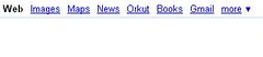
I would add a More Link Like Google does. See the Top Bar of Google with WeB Images Map More >>
To this more >> drop down you can add logic to add button less frequently used by user or something like that.