How can I make a float top with CSS?
The only way to do this with CSS only is by using CSS 3 which is not going to work on every browser (only the latest generation like FF 3.5, Opera, Safari, Chrome).
Indeed with CSS 3 there's this awesome property : column-count that you can use like so :
#myContent{
  column-count: 2;
  column-gap: 20px;
  height: 350px;
}
If #myContent is wrapping your other divs.
More info here : http://www.quirksmode.org/css/multicolumn.html
As you can read there, there are serious limitations in using this. In the example above, it will only add up to one another column if the content overflows. in mozilla you can use the column-width property that allows you to divide the content in as many columns as needed.
Otherwise you'll have to distribute the content between different divs in Javascript or in the backend.
Simply use vertical-align:
.className {
    display: inline-block;
    vertical-align: top;
}
Hugogi Raudel has came up with an interesting way to to achieve this by CSS. suppose here is our HTML markup:
<ul>
  <li>1</li>
  <li>2</li>
  <li>3</li>
  <li>4</li>
  <li>5</li>
  <li>6</li>
  <li>7</li>
  <li>8</li>
  <li>9</li>
</ul>
You can achieve a 3-row column using this CSS code:
li:nth-child(3n+2){
  margin: 120px 0 0 -110px;
}

li:nth-child(3n+3) {
  margin: 230px 0 0 -110px;
}
And here is the end result: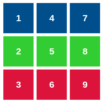
What we are doing here is adding a appropriate margin for each item in the row. This approach limitation is that you have to determine the column row count. it's not going to be dynamic. I'm sure it has use cases so I included this solution here.
- Here is a live demo: http://codepen.io/HugoGiraudel/pen/DoAIB
- You can read more on this in Hugo's blog post