Horizontally scrollable tabs focus on center with snap in flutter
Placing isScrollable: true, in the TabBar worked for me.
class MyHomePage extends StatefulWidget {
  MyHomePage({Key key, this.title}) : super(key: key);

  final String title;

  @override
  _MyHomePageState createState() => _MyHomePageState();
}

class _MyHomePageState extends State<MyHomePage> {
  int _counter = 0;

  void _incrementCounter() {
    setState(() {

  _counter++;
 });
}

@override
Widget build(BuildContext context) {

 final _kTabPages = <Widget>[
   Center(child: Icon(Icons.cloud, size: 64.0, color: Colors.teal)),
   Center(child: Icon(Icons.alarm, size: 64.0, color: Colors.cyan)),
   Center(child: Icon(Icons.forum, size: 64.0, color: Colors.blue)),
   Center(child: Icon(Icons.forum, size: 64.0, color: Colors.blue)),
   Center(child: Icon(Icons.forum, size: 64.0, color: Colors.blue)),
   Center(child: Icon(Icons.forum, size: 64.0, color: Colors.blue)),
   Center(child: Icon(Icons.forum, size: 64.0, color: Colors.blue)),
   Center(child: Icon(Icons.forum, size: 64.0, color: Colors.blue)),
 ];
 final _kTabs = <Tab>[
   Tab(text: 'NK'),
   Tab(text:'ActiveTools'),
   Tab(text:'Coxmate'),
   Tab(text:'Concept2'),
   Tab(text:'Croker'),
   Tab(text:'Hudson'),
   Tab(text:'Swift'),
   Tab(text:'Rowshop'),
 ];
 return DefaultTabController(
   length: _kTabs.length,
   child: Scaffold(
     appBar: AppBar(
     leading:Image.asset("assets/Macarbi Logo.jpg"),//TODO image or icon here
     title: Text(widget.title),
     actions: <Widget>[
       IconButton(
         icon: Icon(Icons.search),
         onPressed: () {},//TODO  do something
       ),
       IconButton(
         icon: Icon(Icons.account_circle),
         onPressed: () {},//TODO do something
       ),
     ],
      bottom: TabBar(
        isScrollable: true,
         tabs: _kTabs,
       ),
   ),
     body: TabBarView(
       children: _kTabPages,
     ),
   ),
 );
}
Screenshot:

Code:
TabBar(
  isScrollable: true, // Required
  unselectedLabelColor: Colors.white30, // Other tabs color
  labelPadding: EdgeInsets.symmetric(horizontal: 30), // Space between tabs
  indicator: UnderlineTabIndicator(
    borderSide: BorderSide(color: Colors.white, width: 2), // Indicator height
    insets: EdgeInsets.symmetric(horizontal: 48), // Indicator width
  ),
  tabs: [
    Tab(text: 'Total Investment'),
    Tab(text: 'Your Earnings'),
    Tab(text: 'Current Balance'),
  ],
)
add isScrollable: true, inside TabBar
like
TabBar(
       isScrollable: true,
.
.
.

)
Same can be achieved using - unselectedLabelColor: & indicatorColor: of TabBar widget.
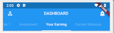
Example Code:
@override
  Widget build(BuildContext context) {
    return DefaultTabController(
      length: 6,
      child: Scaffold(
          appBar: AppBar(
            centerTitle: true,
            leading: Icon(Icons.person_outline),
            title: Text('DASHBOARD',style: TextStyle(fontSize: 16.0),),
            bottom: PreferredSize(
                child: TabBar(
                    isScrollable: true,
                    unselectedLabelColor: Colors.white.withOpacity(0.3),
                    indicatorColor: Colors.white,
                    tabs: [
                      Tab(
                        child: Text('Tab 1'),
                      ),
                      Tab(
                        child: Text('Investment'),
                      ),
                      Tab(
                        child: Text('Your Earning'),
                      ),
                      Tab(
                        child: Text('Current Balance'),
                      ),
                      Tab(
                        child: Text('Tab 5'),
                      ),
                      Tab(
                        child: Text('Tab 6'),
                      )
                    ]),
                preferredSize: Size.fromHeight(30.0)),
            actions: <Widget>[
              Padding(
                padding: const EdgeInsets.only(right: 16.0),
                child: Icon(Icons.add_alert),
              ),
            ],
          ),
          body: TabBarView(
            children: <Widget>[
              Container(
                child: Center(
                  child: Text('Tab 1'),
                ),
              ),
              Container(
                child: Center(
                  child: Text('Tab 2'),
                ),
              ),
              Container(
                child: Center(
                  child: Text('Tab 3'),
                ),
              ),
              Container(
                child: Center(
                  child: Text('Tab 4'),
                ),
              ),
              Container(
                child: Center(
                  child: Text('Tab 5'),
                ),
              ),
              Container(
                child: Center(
                  child: Text('Tab 6'),
                ),
              ),
            ],
          )),
    );
  }
Output: