Grid of responsive squares
You could use vw (view-width) units, which would make the squares responsive according to the width of the screen.
A quick mock-up of this would be:
html,
body {
  margin: 0;
  padding: 0;
}
div {
  height: 25vw;
  width: 25vw;
  background: tomato;
  display: inline-block;
  text-align: center;
  line-height: 25vw;
  font-size: 20vw;
  margin-right: -4px;
  position: relative;
}
/*demo only*/

div:before {
  content: "";
  position: absolute;
  top: 0;
  left: 0;
  height: inherit;
  width: inherit;
  background: rgba(200, 200, 200, 0.6);
  transition: all 0.4s;
}
div:hover:before {
  background: rgba(200, 200, 200, 0);
}
<div>1</div>
<div>2</div>
<div>3</div>
<div>4</div>
<div>5</div>
<div>6</div>
<div>7</div>
<div>8</div>New solution (2022)
CSS has changed since this aswer was written. We now have several properties that can drasticaly simplify code for a square grid :
- The grid property to handle the grid layout (MDN reference)
- The aspect ratio property to handle the square aspect ratio of each grid item (MDN reference)
- The object-fit property to handle image centering and wether they should cover the square or not (MDN reference)
Here is an example :
.grid {
  display: grid;
  grid-template-columns: repeat(3, 1fr);
  gap: 2%;
}

.square {
  aspect-ratio: 1/ 1;
  display: flex;
  align-items: center;
  padding: 5%;
  background-color: #1E1E1E;
  color: #fff;
}

.square img {
  width: 100%;
  height: 100%;
  object-fit: contain;
  object-position: center;
}

.square.fullImg {
  padding: 0;
}

.square.fullImg img {
  object-fit: cover;
}
<div class="grid">
<div class="square">
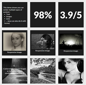
<ul>This demo shows you can center multiple types of content :
<li>Text</li>
<li>Images</li>
<li>Lists</li>
<li>... (you can also do it with forms)</li>
</ul>
</div>
<div class="square">98%</div>
<div class="square">3.9/5</div>
<div class="square"><img src="https://farm3.staticflickr.com/2878/10944255073_973d2cd25c.jpg" /></div>
<div class="square"><img src="https://farm9.staticflickr.com/8461/8048823381_0fbc2d8efb.jpg" /></div>
<div class="square"><img class="rs" src="https://farm5.staticflickr.com/4144/5053682635_b348b24698.jpg" /></div>
<div class="square fullImg"><img src="https://farm9.staticflickr.com/8461/8048823381_0fbc2d8efb.jpg" /></div>
<div class="square fullImg"><img class="rs" src="https://farm5.staticflickr.com/4144/5053682635_b348b24698.jpg" /></div>
<div class="square fullImg"><img src="https://farm3.staticflickr.com/2878/10944255073_973d2cd25c.jpg" /></div>
</div>Previous answer
This still works but CSS has changed since it was written and ne properties can make the code simpler and easier to understand.
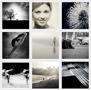
You can make responsive grid of squares with vertically and horizontally centered content only with CSS. I will explain how in a step by step process but first here are 2 demos of what you can achieve:
- Grid of square images
- Grid of squares with content
Now let's see how to make these fancy responsive squares!
1. Making the responsive squares :
The trick for keeping elements square (or whatever other aspect ratio) is to use percent padding-bottom.
Side note: you can use top padding too or top/bottom margin but the background of the element won't display.
As top padding is calculated according to the width of the parent element (See MDN for reference), the height of the element will change according to its width. You can now Keep its aspect ratio according to its width.
At this point you can code:
HTML :
<div></div>
CSS :
div {
    width: 30%;
    padding-bottom: 30%; /* = width for a square aspect ratio */
}
Here is a simple layout example of 3*3 squares grid using the code above.
With this technique, you can make any other aspect ratio, here is a table giving the values of bottom padding according to the aspect ratio and a 30% width.
 Aspect ratio  |  padding-bottom  |  for 30% width
------------------------------------------------
    1:1        |  = width         |    30%
    1:2        |  width x 2       |    60%
    2:1        |  width x 0.5     |    15%
    4:3        |  width x 0.75    |    22.5%
    16:9       |  width x 0.5625  |    16.875%
2. Adding content inside the squares :
As you can't add content directly inside the squares (it would expand their height and squares wouldn't be squares anymore) you need to create child elements (for this example I am using divs) inside them with position: absolute; and put the content inside them. This will take the content out of the flow and keep the size of the square.
Don't forget to add position:relative; on the parent divs so the absolute children are positioned/sized relatively to their parent.
Let's add some content to our 3x3 grid of squares :
HTML :
<div class="square">
    <div class="content">
        .. CONTENT HERE ..
    </div>
</div>
... and so on 9 times for 9 squares ...
CSS :
.square {
    float: left;
    position: relative;
    width: 30%;
    padding-bottom: 30%; /* = width for a 1:1 aspect ratio */
    margin: 1.66%;
    overflow: hidden;
}

.content {
    position: absolute;
    height: 80%; /* = 100% - 2*10% padding */
    width: 90%; /* = 100% - 2*5% padding */
    padding: 10% 5%;
}
RESULT <-- with some formatting to make it pretty!
3. Centering the content :
Horizontally :
This is pretty easy, you just need to add text-align:center to .content.
RESULT
Vertical alignment :
This becomes serious! The trick is to use
display: table;
/* and */
display: table-cell;
vertical-align: middle;
but we can't use display:table; on .square or .content divs because it conflicts with position:absolute; so we need to create two children inside .content divs. Our code will be updated as follow :
HTML :
<div class="square">
    <div class="content">
        <div class="table">
            <div class="table-cell">
                ... CONTENT HERE ...
            </div>
        </div>
    </div>
</div>
... and so on 9 times for 9 squares ...
CSS :
.square {
    float:left;
    position: relative;
    width: 30%;
    padding-bottom : 30%; /* = width for a 1:1 aspect ratio */
    margin:1.66%;
    overflow:hidden;
}

.content {
    position:absolute;
    height:80%; /* = 100% - 2*10% padding */
    width:90%; /* = 100% - 2*5% padding */
    padding: 10% 5%;
}

.table{
    display:table;
    height:100%;
    width:100%;
}

.table-cell{
    display:table-cell;
    vertical-align:middle;
    height:100%;
    width:100%;
}
We have now finished and we can take a look at the result here :
LIVE FULLSCREEN RESULT
editable fiddle here