Flutter ButtonRow padding
Also, the ButtonBar itself has a buttonPadding attribute that you can customize.
Overrides the surrounding ButtonThemeData.padding to define the padding for a button's child (typically the button's label).
If null then it will use the surrounding ButtonBarTheme.buttonPadding. If that is null, it will default to 8.0 logical pixels on the left and right.
ButtonBar(
  buttonPadding: EdgeInsets.all(0),
  children: <Widget>[
    FlatButton(
      child: Text('Hello'),
      onPressed: () => print(),
      materialTapTargetSize: MaterialTapTargetSize.shrinkWrap,
    ),
  ],
),
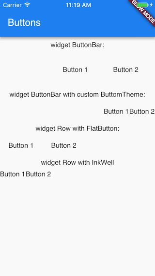
You have different ways to customize buttons:
- customize ButtonTheme for ButtonBar
- use Row instead of ButtonBar
- implement your own button via InkWell
- etc
What to use depends on your cases/requirements. Here quick example of different ways:
class ButtonRowWidget extends StatelessWidget {
  @override
  Widget build(BuildContext context) {
    return new Scaffold(
      appBar: new AppBar(
        title: new Text("Buttons"),
      ),
      body: new Column(mainAxisSize: MainAxisSize.min, children: <Widget>[
        new Container(
          child: new Text("widget ButtonBar:"),
          margin: new EdgeInsets.fromLTRB(0.0, 10.0, 0.0, 10.0),
        ),
        new ButtonBar(children: <Widget>[
          new FlatButton(
            child: new Text("Button 1"),
            onPressed: () => debugPrint("Button 1"),
          ),
          new FlatButton(
            child: new Text("Button 2"),
            onPressed: () => debugPrint("Button 2"),
          )
        ]),
        new Container(
          child: new Text("widget ButtonBar with custom ButtomTheme:"),
          margin: new EdgeInsets.fromLTRB(0.0, 10.0, 0.0, 10.0),
        ),
        new ButtonTheme(
          minWidth: 44.0,
          padding: new EdgeInsets.all(0.0),
          child: new ButtonBar(children: <Widget>[
            new FlatButton(
              child: new Text("Button 1"),
              onPressed: () => debugPrint("Button 1"),
            ),
            new FlatButton(
              child: new Text("Button 2"),
              onPressed: () => debugPrint("Button 2"),
            ),
          ]),
        ),
        new Container(
          child: new Text("widget Row with FlatButton:"),
          margin: new EdgeInsets.fromLTRB(0.0, 10.0, 0.0, 10.0),
        ),
        new Row(
          children: <Widget>[
            new FlatButton(
              child: new Text("Button 1"),
              onPressed: () => debugPrint("Button 1"),
            ),
            new FlatButton(
              child: new Text("Button 2"),
              onPressed: () => debugPrint("Button 2"),
            ),
          ],
        ),
        new Container(
          child: new Text("widget Row with InkWell"),
          margin: new EdgeInsets.fromLTRB(0.0, 10.0, 0.0, 10.0),
        ),
        new Row(
          children: <Widget>[
            new InkWell(
              child: new Text("Button 1"),
              onTap: () => debugPrint("Button 1"),
            ),
            new InkWell(
              child: new Text("Button 2"),
              onTap: () => debugPrint("Button 2"),
            ),
          ],
        )
      ]),
    );
  }
}
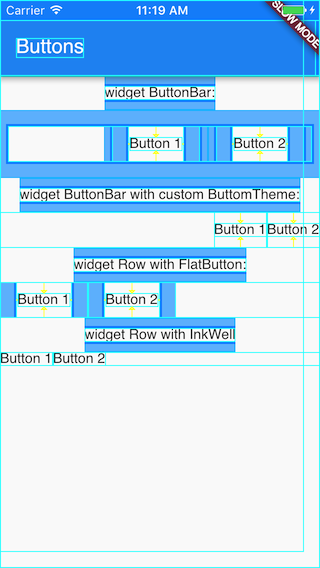
Debug paint can be helpful in this case.