flex-grow not sizing flex items as expected
Short Analysis
The problem is that rows 1-3 have two horizontal margins and row 4 only has one.
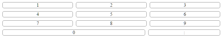
With horizontal margins at 10px each, row 4 has 10px more free space than the other rows. This throws off the alignment of the columns.
Because flex-grow applies only to free space, and is heavily influenced by content and margins, it's not the most secure way to size flex items.
Try flex-basis instead. Add this to your code:
.button    { flex-basis: 33.33%; }
#number0   { flex-basis: calc(66.67% + 10px); }
*          { box-sizing: border-box; }
.numbers {
    display: flex;
    flex-direction: column;
}

.row {
    display: flex;
    flex-direction: row;
    flex-grow: 1;
    justify-content: space-between;
}

.button {
    display: flex;
    flex-basis: 33.33%;
    justify-content: center;
    align-items: center;
    margin: 5px;
    border-radius: 5px;
    border: 1px solid gray;
    background: rgba(255, 255, 255, 0.2);
    cursor: pointer;
}

#number0   { flex-basis: calc(66.67% + 10px); }
*          { box-sizing: border-box; }
<div class="numbers">
<div class="row">
<div class="button number" id="number1">1</div>
<div class="button number" id="number2">2</div>
<div class="button number" id="number3">3</div>
</div>
<div class="row">
<div class="button number" id="number4">4</div>
<div class="button number" id="number5">5</div>
<div class="button number" id="number6">6</div>
</div>
<div class="row">
<div class="button number" id="number7">7</div>
<div class="button number" id="number8">8</div>
<div class="button number" id="number9">9</div>
</div>
<div class="row">
<div class="button number" id="number0">0</div>
<div class="button" id="colon">:</div>
</div>
</div>Extended Analysis
You wrote:
It seems that the content inside a flex div affects its calculated size concerning the
flex-growproperty. Am I doing something wrong?
The source of your problem is not the content inside the flex item.
You wrote:
In the fiddle provided below, you'll see a number pad. All the rows contain 3 numbers except the bottom row. That row should have the '0' be the width of 2 numbers, hence
flex-grow: 2and the ':' be the size of 1 number, henceflex-grow: 1. Am I missing something here?
Yes. Your interpretation of the flex-grow property is incorrect. flex-grow is not intended for defining the size of a flex item. Its job is to distribute free space in the flex container among items.
By applying flex-grow: 1 to a group of flex items, you are telling them to distribute free space evenly among themselves. This is why, in your demo, rows 1, 2 and 3 have equally sized flex items.
When you apply flex-grow: 2, you are telling the flex item to consume twice as much free space as items with flex-grow: 1.
But where does the second 10px margin from the rows above factor into the layout of row 4?
The reason the alignment is off on row 4 is that row 4 has one less margin than the other rows, meaning that row 4 has 10px more free space than the other rows.
You'll notice that if you remove the margin rule you get your desired alignment.
.numbers {
    display: flex;
    flex-direction: column;
}

.row {
    display: flex;
    flex-direction: row;
    flex-grow: 1;
    justify-content: space-between;
}

.button {
    display: flex;
    flex-grow: 1;
    justify-content: center;
    align-items: center;
    /* margin: 5px; */
    border-radius: 5px;
    border: 1px solid gray;
    background: rgba(255, 255, 255, 0.2);
    cursor: pointer;
}

.button#number0 {
    flex-grow: 2;
}

.button#colon {
    flex-grow: 1;
}
<div class="numbers">
<div class="row">
<div class="button number" id="number1">1</div>
<div class="button number" id="number2">2</div>
<div class="button number" id="number3">3</div>
</div>
<div class="row">
<div class="button number" id="number4">4</div>
<div class="button number" id="number5">5</div>
<div class="button number" id="number6">6</div>
</div>
<div class="row">
<div class="button number" id="number7">7</div>
<div class="button number" id="number8">8</div>
<div class="button number" id="number9">9</div>
</div>
<div class="row">
<div class="button number" id="number0">0</div>
<div class="button" id="colon">:</div>
</div>
</div>So what happens on row four to that second 10px margin?
It gets absorbed by the two flex items.
Here's how
flex-growdistributes the extra space on row four:
- Flex item left (with content "0") has
flex-grow: 2. (.button#number0in your code.)- Flex item right (with content ":") has
flex-grow: 1. (.button#colonin your code.)- The second inter-item margin, which appears only on rows with three flex items, is 10px wide. (The code says 5px around each item, but in CSS horizontal margins never collapse. Moreover, in flexbox, no margins collapse.)
- The sum total of the
flex-growvalues is three. So let's divide 10px by 3. Now we know that the proportion of 1 is 3.33px.- Hence, flex item left gets 6.66px of the extra space, and flex item right gets 3.33px.
- Let's say that flex item left had
flex-grow: 3instead. Then flex item left would get 7.5px, and flex item right would get 2.5px.
The last part of your question says:
The right side of the '0' should be aligned with the 8, 5, and 2 above it. It's a bit off.
Because flex-grow applies only to free space, and is heavily influenced by content and margins, it's not the most secure way to size flex items.
Try flex-basis instead. Add this to your code:
.button    { flex-basis: 33.33%; }
#number0   { flex-basis: calc(66.67% + 10px); }
*          { box-sizing: border-box; }
.numbers {
    display: flex;
    flex-direction: column;
}

.row {
    display: flex;
    flex-direction: row;
    flex-grow: 1;
    justify-content: space-between;
}

.button {
    display: flex;
    flex-basis: 33.33%;
    justify-content: center;
    align-items: center;
    margin: 5px;
    border-radius: 5px;
    border: 1px solid gray;
    background: rgba(255, 255, 255, 0.2);
    cursor: pointer;
}

#number0   { flex-basis: calc(66.67% + 10px); }
*          { box-sizing: border-box; }
<div class="numbers">
<div class="row">
<div class="button number" id="number1">1</div>
<div class="button number" id="number2">2</div>
<div class="button number" id="number3">3</div>
</div>
<div class="row">
<div class="button number" id="number4">4</div>
<div class="button number" id="number5">5</div>
<div class="button number" id="number6">6</div>
</div>
<div class="row">
<div class="button number" id="number7">7</div>
<div class="button number" id="number8">8</div>
<div class="button number" id="number9">9</div>
</div>
<div class="row">
<div class="button number" id="number0">0</div>
<div class="button" id="colon">:</div>
</div>
</div>jsFiddle demo
References:
flex-growdefinition ~ MDNflex-basisdefinition ~ MDN- 7.2 Components of Flexibility ~ W3C
EXTRA: CSS GRID SOLUTION
With the advent of CSS Grid, the code for this entire layout can be greatly simplified.
.numbers {
  display: grid;
  grid-template-columns: repeat(auto-fill, minmax(26%, 1fr));
  grid-gap: 10px;
}

#number0 {
  grid-column: span 2;
}


/* non-essential decorative styles */
.button {
  display: flex;
  justify-content: center;
  align-items: center;
  border-radius: 5px;
  border: 1px solid gray;
}
<div class="numbers">
<div class="button number" id="number1">1</div>
<div class="button number" id="number2">2</div>
<div class="button number" id="number3">3</div>
<div class="button number" id="number4">4</div>
<div class="button number" id="number5">5</div>
<div class="button number" id="number6">6</div>
<div class="button number" id="number7">7</div>
<div class="button number" id="number8">8</div>
<div class="button number" id="number9">9</div>
<div class="button number" id="number0">0</div>
<div class="button" id="colon">:</div>
</div>I think everything that Michael_B said is correct. Only the solutions is a bit awkward. I personsally don't like calc. It just doesn't feel right.
The problem you have is a more general one. You put too many responsibilities onto one element. In this case it the .button class. Flex and Margin with flex-grow is too much responsibility. Try to break that apart. It means more DOM elements, but it saves you a lot of pain.
.numbers {
  display: flex;
  flex-direction: column;
  max-width: 200px;
  margin: 0 auto;
}

.row {
  display: flex;
  flex-direction: row;
  flex-grow: 1;
  justify-content: space-between;
}

.row > .box {
  display: flex;
  flex-basis: 33.3333%;
  justify-content: center;
  align-items: center;
}

.row > .box.box-2 {
  flex-basis: 66.6667%;
}

.button {
  border-radius: 5px;
  border: 1px solid gray;
  background: rgba(255, 255, 255, 0.2);
  cursor: pointer;
  width: auto;
  text-align: center;
  margin: 5px;
  width: 100%;
}
<div class="numbers">
<div class="row">
<div class="box"><div class="button number" id="number1">1</div></div>
<div class="box"><div class="button number" id="number2">2</div></div>
<div class="box"><div class="button number" id="number3">3</div></div>
</div>
<div class="row">
<div class="box"><div class="button number" id="number4">4</div></div>
<div class="box"><div class="button number" id="number5">5</div></div>
<div class="box"><div class="button number" id="number6">6</div></div>
</div>
<div class="row">
<div class="box"><div class="button number" id="number7">7</div></div>
<div class="box"><div class="button number" id="number8">8</div></div>
<div class="box"><div class="button number" id="number9">9</div></div>
</div>
<div class="row">
<div class="box box-2"><div class="button number" id="number0">0</div></div>
<div class="box"><div class="button" id="colon">:</div></div>
</div>
</div>Update 3:
I figured out yet another way to get rid of the misalignment.
This version, together with the 2:nd update, works with the original html untouched, and is using pseudo elements to create the buttons, button hover/click effects included.
flex only version
.row {
  width: 60%;
  margin: auto;
  display: flex;
}
.button {
  flex: 0 0 33.3%;
  text-align: center;
  position: relative;
  padding: 10px 5px;
  box-sizing: border-box;
  pointer-events: none;
}
.button#number0 {
  flex: 0 0 66.6%;
}

.button:before,
.button:after {
  content: " ";
  border-radius: 5px;
  border: 1px solid gray;
  cursor: pointer;
  position: absolute;
  left: 5px;
  top: 5px;
  right: 5px;
  bottom: 5px;
  pointer-events: auto;
}
.button:before {
  background: rgba(255, 255, 255, 0.9);
  z-index: -1
}
.button:hover:before {
  background: rgba(0, 0, 0, 0.1);
}
.button:hover:after {
  border: 2px solid red;
}
.button:active:before {
  background: rgba(255, 0, 0, 0.5);
}
<div class="numbers">
<div class="row">
<div class="button number" id="number1">1</div>
<div class="button number" id="number2">2</div>
<div class="button number" id="number3">3</div>
</div>
<div class="row">
<div class="button number" id="number4">4</div>
<div class="button number" id="number5">5</div>
<div class="button number" id="number6">6</div>
</div>
<div class="row">
<div class="button number" id="number7">7</div>
<div class="button number" id="number8">8</div>
<div class="button number" id="number9">9</div>
</div>
<div class="row">
<div class="button number" id="number0">0</div>
<div class="button" id="colon">:</div>
</div>
</div>flex version with a display: table fallback for browsers that does not support the new flexbox model.
.row {
  display: table;              /* remove for flex only */
  width: 60%;
  margin: auto;
  display: flex;
}
.button {
  display:table-cell;          /* remove for flex only */
  width: 33.3%;                /* remove for flex only */
  flex: 0 0 33.3%;
  text-align: center;
  position: relative;
  padding: 10px 5px;
  box-sizing: border-box;
  pointer-events: none;
}
.button#number0 {
  width: 66.6%;                /* remove for flex only */
  flex: 0 0 66.6%;
}

.button:before,
.button:after {
  content: " ";
  border-radius: 5px;
  border: 1px solid gray;
  cursor: pointer;
  position: absolute;
  left: 5px;
  top: 5px;
  right: 5px;
  bottom: 5px;
  pointer-events: auto;
}
.button:before {
  background: rgba(255, 255, 255, 0.9);
  z-index: -1
}
.button:hover:before {
  background: rgba(0, 0, 0, 0.1);
}
.button:hover:after {
  border: 2px solid red;
}
.button:active:before {
  background: rgba(255, 0, 0, 0.5);
}
<div class="numbers">
<div class="row">
<div class="button number" id="number1">1</div>
<div class="button number" id="number2">2</div>
<div class="button number" id="number3">3</div>
</div>
<div class="row">
<div class="button number" id="number4">4</div>
<div class="button number" id="number5">5</div>
<div class="button number" id="number6">6</div>
</div>
<div class="row">
<div class="button number" id="number7">7</div>
<div class="button number" id="number8">8</div>
<div class="button number" id="number9">9</div>
</div>
<div class="row">
<div class="button number" id="number0">0</div>
<div class="button" id="colon">:</div>
</div>
</div>Update 2:
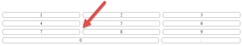
In addition to Michael_B's answer, which by the way has a very good explanation, is here an updated version, that actually does give the desired alignment without the, in this case, 1-2 px off.
Here is a fiddle sample, and an image, of both mine and Michael_B versions, where the border has been increased a little to make it easier to see the misalignment.
It all comes down to how flexbox calculates sizes when border/padding is present, which you can read more about in this post, where box-sizing: border-box needs to be set along with a few more adjustments, which is commented in the code.
Here is my fiddle and snippet
.row {
    display: flex;
    width: calc(100% - 30px);   /* 30px = the sum of the buttons margin: 5px
                                          to avoid horizontal scroll            */
}

.button {
    display: flex;
    flex-basis: 33.33%;
    flex-shrink: 0;             /* we need flex-grow/shrink to be 1/0 to make
                                   it calculate the size properly               */
    box-sizing: border-box;     /* to take out the borders when calculate the
                                   flex shrink/grow factor                      */
    justify-content: center;
    align-items: center;
    margin: 5px;
    border-radius: 5px;
    border: 1px solid gray;
    background: rgba(0, 0, 0, 0.1);
    cursor: pointer;
}

#number0 {
    flex-basis: calc(66.66% + 10px);
}
<div class="numbers">
<div class="row">
<div class="button number" id="number1">1</div>
<div class="button number" id="number2">2</div>
<div class="button number" id="number3">3</div>
</div>
<div class="row">
<div class="button number" id="number4">4</div>
<div class="button number" id="number5">5</div>
<div class="button number" id="number6">6</div>
</div>
<div class="row">
<div class="button number" id="number7">7</div>
<div class="button number" id="number8">8</div>
<div class="button number" id="number9">9</div>
</div>
<div class="row">
<div class="button number" id="number0">0</div>
<div class="button" id="colon">:</div>
</div>
</div>Update:
flex only version, with a minor change of the existing html structure, using pseudo elements.
.row {
  display: flex;
}
.button {
  flex: 0 0 33.3%;
}
.button:after {
  content: attr(data-nr);
  display: block;
  border-radius: 5px;
  border: 1px solid gray;
  background: rgba(255, 255, 255, 0.9);
  text-align: center;
  padding: 3px;
  margin: 5px;
  cursor: pointer;
}
.button#number0 {
  flex: 0 0 66.6%;
}
<div class="numbers">
<div class="row">
<div class="button number" id="number1" data-nr="1"></div>
<div class="button number" id="number2" data-nr="2"></div>
<div class="button number" id="number3" data-nr="3"></div>
</div>
<div class="row">
<div class="button number" id="number4" data-nr="4"></div>
<div class="button number" id="number5" data-nr="5"></div>
<div class="button number" id="number6" data-nr="6"></div>
</div>
<div class="row">
<div class="button number" id="number7" data-nr="7"></div>
<div class="button number" id="number8" data-nr="8"></div>
<div class="button number" id="number9" data-nr="9"></div>
</div>
<div class="row">
<div class="button number" id="number0" data-nr="0"></div>
<div class="button" id="colon" data-nr=":"></div>
</div>
</div>flex version, with a minor change of the existing html structure, using pseudo elements, and has a display: table fallback for browsers that does not support the new flexbox model (like IE8/9).
.row {
  display: table;
  width: 100%;
}
.button {
  display: table-cell;
  width: 33.3%;
  padding: 5px;
}
.button:after {
  content: attr(data-nr);
  display: block;
  border-radius: 5px;
  border: 1px solid gray;
  background: rgba(255, 255, 255, 0.9);
  text-align: center;
  padding: 3px;
  cursor: pointer;
}
.button#number0 {
  width: 66.6%;
}


@supports (display: flex) {
  .row {
    display: flex;
  }
  .button {
    display: block;
    width: auto;
    flex: 0 0 33.3%;
    padding: 0;
  }
  .button#number0 {
    flex: 0 0 66.6%;
  }
  .button:after {
    margin: 5px;
  }
}
<div class="numbers">
<div class="row">
<div class="button number" id="number1" data-nr="1"></div>
<div class="button number" id="number2" data-nr="2"></div>
<div class="button number" id="number3" data-nr="3"></div>
</div>
<div class="row">
<div class="button number" id="number4" data-nr="4"></div>
<div class="button number" id="number5" data-nr="5"></div>
<div class="button number" id="number6" data-nr="6"></div>
</div>
<div class="row">
<div class="button number" id="number7" data-nr="7"></div>
<div class="button number" id="number8" data-nr="8"></div>
<div class="button number" id="number9" data-nr="9"></div>
</div>
<div class="row">
<div class="button number" id="number0" data-nr="0"></div>
<div class="button" id="colon" data-nr=":"></div>
</div>
</div>