CSS3 transform order matters: rightmost operation first
Yes, the first operation done is the one the most on the right., i.e. here operation2 is done before operation1.
This MDN article states indeed:
The transform functions are multiplied in order from left to right, meaning that composite transforms are effectively applied in order from right to left.
Here is the documentation : http://www.w3.org/TR/css-transforms-1/.
Example 1
Here the scaling is done first, and then the translation of 100px vertically (if translation was done first, the scaling would make the translation of 500px!)
#container {
  	position: absolute;
  	transform: translate(0,100px) scale(5);
  	transform-origin: 0 0; }
<div id="container"><img src="https://i.stack.imgur.com/xb47Y.jpg"></img></div>Example 2
Here the translation is done first, and then the scaling (the scaling done after makes that the translation looks like a 500px-translation!)
#container {
  	position: absolute;
  	transform: scale(5) translate(0,100px);
  	transform-origin: 0 0; }
<div id="container"><img src="https://i.stack.imgur.com/xb47Y.jpg"></img></div>Transforms are performed left to right. Transforms correspond to matrix operations, and these are performed left to right.
There is intuition behind it, it's not just that this is literally in the spec as a normative rule (point 3 here: https://drafts.csswg.org/css-transforms-1/#transform-rendering)
Here's a pen to try: https://codepen.io/monfera/pen/YLWGrM
Explanation:
Each transform step establishes its own coordinate system. So
transform: translateX(500px);
establishes a new coordinate system 500px along the X axis of its parent, and the element will be rendered there.
Similarly,
background-color: blue;
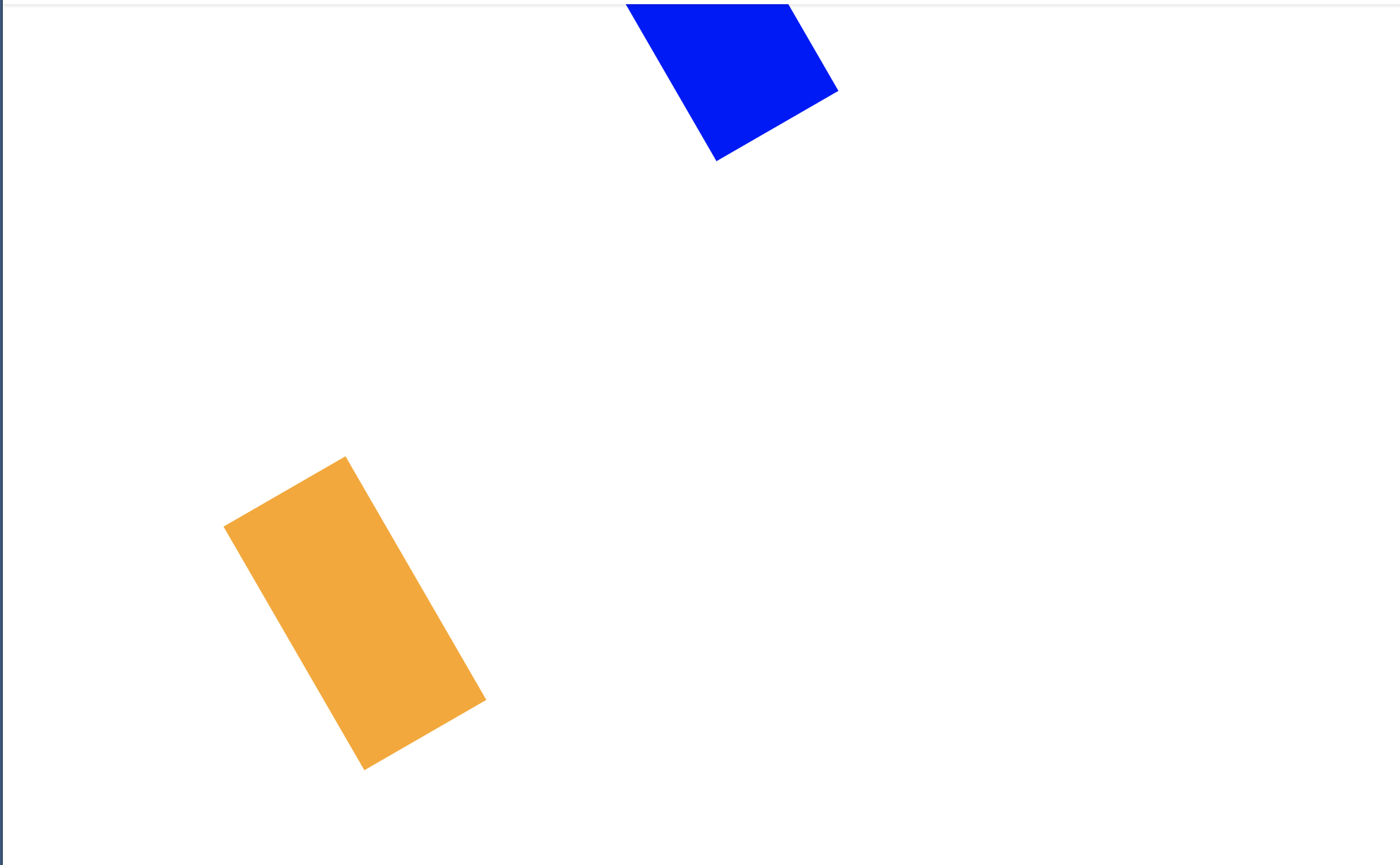
transform: translateX(500px) rotate(60deg);
first establishes a new coordinate system 500px along the X axis (to the right) of its parent, and only then, within that (translated, but it's now irrelevant) coordinate system does it perform the rotation. So it'll be a shape that's 500px to the right, and rotated in place (around the so-called transform-origin which is interpreted in the local coordinate system, and the default 50% 50% for rotation means, rotation around the center of the rectangle, but it's an aside).
The reverse order
background-color: orange;
transform: rotate(60deg) translateX(500px);
first establishes a new coordinate system that's rotated 60 degrees relative to the parent, and then translates 100px along the X axis of the now rotated coordinate system, in a direction that is not actually to the right from the global viewpoint of the document (or user). So, in this case, it's as if you first rotated the paper, and then slid the shape 500 units along the side of the paper (from the origin, which is in this case the top left corner).
For a more advanced discussion, and understanding of how it's possible to intuitively understand it for both directions, check out Composing Transformations - CSS transforms follow the post-multiplication model, so look for the page with the heading "Think of transformations as transforming the local coordinate frame" (illustrations seem to be a little off though)

This has been mentioned in other answers and comments, but not with enough emphasis in my opinion: the short answer is both ways are valid.
It all depends whether you consider your coordinates attached to your element (left to right) or fixed to the page based on the initial element position (right to left).
Here is an article showing the difference with animations (which makes it easier to understand): Chaining transforms.
Here is a snippet showing the animations from the article:
html, body { height: 100%; }
body {
  background: #aaa;
  color: #000;
  font-family: Calibri,Candara,Segoe,"Segoe UI",Optima,Arial,sans-serif;
  overflow: hidden;
  margin: 0;
}
.info {
  text-align: center;
  font-family: Consolas,monaco,monospace;
  font-size: 20px;
  font-weight: bold;
  margin-bottom: 4px;
  color: #fff;
}
.split { white-space: nowrap; }
.side {
  display: inline-block;
  width: 50%;
}
.label {
  text-align: center;
  font-size: 20px;
}
.container {
  position: relative;
  font-size: 50px;
  margin: .6em auto 0;
  width: 0; height: 0;
  transform: translateX(-1em);
}
.ltr .object {
  position: absolute;
  left: 0; top: 0;
  width: 1em; height: 1em;
  margin: -.5em 0 0 -.5em;
  background: rgb(114,34,34);
  animation: ltrObj 5s infinite;
}
@keyframes ltrObj {
  from, 10% { transform: rotate( 0deg) translateX(0em); }
  40%       { transform: rotate(45deg) translateX(0em); }
  70%, to   { transform: rotate(45deg) translateX(2em); }
}
.object.shadow {
  animation: none;
  opacity: .2;
}

.ltr .axes {
  position: absolute;
  left: .5em; top: .5em;
  width: 1em; height: 1em;
  color: #111;
  box-sizing: border-box;
  border-left: 2px solid;
  border-top: 2px solid;
}
.ltr .axes::before, .ltr .axes::after {
  content: '';
  position: absolute;
  width: .2em; height: .2em;
  box-sizing: border-box;
  border-left: 2px solid;
  border-top: 2px solid;
  transform-origin: top left;
}
.ltr .axes::before { top: 100%; left: 0; margin-left: -1px; margin-top: 1px; transform: rotate(225deg); }
.ltr .axes::after { top: 0; left: 100%; margin-top: -1px; margin-left: 1px; transform: rotate(135deg); }

.rtl .axes {
  position: absolute;
  left: 0; top: 0;
  width: 2.5em; height: 2.3em;
  color: #111;
  box-sizing: border-box;
  border-left: 2px solid;
  border-top: 2px solid;
}
.rtl .axes::before, .rtl .axes::after {
  content: '';
  position: absolute;
  width: .2em; height: .2em;
  box-sizing: border-box;
  border-left: 2px solid;
  border-top: 2px solid;
  transform-origin: top left;
}
.rtl .axes::before { top: 100%; left: 0; margin-left: -1px; margin-top: 1px; transform: rotate(225deg); }
.rtl .axes::after { top: 0; left: 100%; margin-top: -1px; margin-left: 1px; transform: rotate(135deg); }

.rtl .object {
  position: absolute;
  left: 0; top: 0;
  width: 1em; height: 1em;
  margin: -.5em 0 0 -.5em;
  background: rgba(100,0,0,0.8);
  animation: rtlObj 5s infinite;
}
@keyframes rtlObj {
  from, 10% { transform: rotate( 0deg) translateX(0em); }
  40%       { transform: rotate( 0deg) translateX(2em); }
  70%, to   { transform: rotate(45deg) translateX(2em); }
}

.helper-mask {
  position: absolute;
  left: 0; top: 0;
  width: 3em; height: 3em;
  overflow: hidden;
}
.helper {
  position: absolute;
  left: 0; top: -2em;
  width: 0; height: 2em;
  margin-top: 2px;
  box-sizing: border-box;
  border: 2px solid #00c;
  border-left: none;
  border-radius: 0 100% 0 0;
  transform-origin: bottom left;
  animation: helper 5s infinite;
}
@keyframes helper {
  from, 10% { width: 0em; transform: rotate( 0deg); }
  40%       { width: 2em; transform: rotate( 0deg);}
  70%, to   { width: 2em; transform: rotate(45deg);}
}
<div class="info">rotate(45deg) translateX(2em)</div>
<div class="split">
<div class="side ltr">
<div class="label">Left to Right</div>
<div class="container">
<div class="object shadow"></div>
<div class="object">
<div class="axes"></div>
</div>
</div>
</div>
<div class="side rtl">
<div class="label">Right to Left</div>
<div class="container">
<div class="axes"></div>
<div class="object"></div>
<div class="helper-mask">
<div class="helper"></div>
</div>
</div>
</div>
</div>Whether the actual implementation uses left to right or right to left is irrelevant, both are equally valid when creating an animation, as long as you keep the difference in mind.