CSS triangle custom border color
You actually have to fake it with two triangles....
.container {
    margin: 15px 30px;
    width: 200px;
    background: #fff;
    border: 1px solid #a00;
    position: relative;
    min-height: 200px;
    padding: 20px;
    text-align: center;
    color: #fff;
    font: bold 1.5em/180px Helvetica, sans-serif;
    text-shadow: 0 0 1px #000;
}

.container:after,
.container:before {
    content: '';
    display: block;
    position: absolute;
    left: 100%;
    width: 0;
    height: 0;
    border-style: solid;
}

.container:after {
    top: 10px;
    border-color: transparent transparent transparent #fdd;
    border-width: 10px;
}

.container:before {
    top: 9px;
    border-color: transparent transparent transparent #a00;
    border-width: 11px;
}
Updated Fiddle here
I think this is a simpler one using clip-path:
.container {
  width: 150px;
  min-height: 150px;
  background: #ccc;
  padding: 8px;
  padding-right: 6%;
  display: inline-block;
  clip-path: polygon(0% 0%,0% 100%,90% 100%,90% 5%,100% 10%,90% 15%,90% 0%);
}
<div class="container">
test content
</div>Another way to accomplish this, especially for somebody who needs this to work with equilateral or even scalene triangles like I did, is to use filter: drop-shadow(...) with multiple values and no blur radius. This has the added benefit of not needing multiple elements, or access to both :before and :after (I was trying to accomplish this with :after content that was inline, so wanted to avoid absolute positioning too).
For the above case, the :after's CSS could look like this (fiddle):
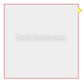
.container {
  margin-left: 15px;
  width: 200px;
  background: #FFFFFF;
  border: 1px solid #CAD5E0;
  padding: 4px;
  position: relative;
  min-height: 200px;
}
.container:after {
  content: '';
  display: block;
  position: absolute;
  top: 10px;
  left: 100%;
  width: 0;
  height: 0;
  border-style: solid;
  border-width: 20px 0 40px 15px; /* skewed to show support for non-right-angle triangles */
  border-color: transparent transparent transparent #fff;
  filter: drop-shadow(1px 0 0 #CAD5E0) drop-shadow(0 .5px 0 #CAD5E0);
}
<div class="container">
Test Container
</div>I think there are some limitations or weirdness, though:
- No support in IE11 (though seems fine in FF, Chrome, and Edge)
- I'm not quite sure why .5px for the
<offset-y>value in the second drop-shadow() above appears more like 1px than 1px would have, though I imagine it's related to trigonometry (though at least on my monitor I see no difference between the actual trig-based values or .5px or even .1px for that matter). - Borders greater than 1px (well, their appearance that way) don't seem to work well. Or at least I haven't found the solution, though see below for a less-than-optimal way to go a little bigger. (I would think the documented-but-unsupported 4th parameter (
<spread-radius>) of drop-shadow() might be what I'm really looking for instead of multiple filter values, but adding it in just broke things entirely.) Here you can see what starts to happen when going beyond 1px (fiddle):
.container {
  background-color: #eee;
  padding: 1em;
}
.container:after {
  content: "";
  width: 0;
  height: 0;
  border-style: solid;
  border-width: 20.4px 10px 0 10px;
  border-color: yellow transparent transparent transparent;
  margin-left: .25em;
  display: inline-block;
  filter: drop-shadow(-6px -4px 0 green) drop-shadow(6px -4px 0 red) drop-shadow(0 6px 0 blue);
}
<div class="container">
Test Container
</div>Notice the funniness that the first one (green) gets applied once, but the second one (red) is getting applied both to the yellow triangle created via border as well as the green drop-shadow(), and the last one (blue) gets applied to all of the above. (Perhaps that's also related to the .5px appearance thing).
But I guess you can take advantage of these drop-shadows building on each other if you need something wider-looking than 1px, by changing them to something like the following (fiddle):
filter: drop-shadow(0 0 2.5px red) drop-shadow(0 0 0 red) drop-shadow(0 0 0 red) drop-shadow(0 0 0 red) drop-shadow(0 0 0 red) drop-shadow(0 0 0 red) drop-shadow(0 0 0 red) drop-shadow(0 0 0 red) drop-shadow(0 0 0 red);
where the very first one has a blur-radius set (2.5px in this case, though the result appears multiplied), and all the rest have blur at 0. But this will only work for the same color on all sides, and it results in some rounded-looking corners as well as quite rough edges the bigger you go.
I know you accept that but check this one also with less css:
.container {
    margin-left: 15px;
    width: 200px;
    background: #FFFFFF;
    border: 1px solid #CAD5E0;
    padding: 4px;
    position: relative;
    min-height: 200px;
}

.container:after {
    content: '';
    display: block;
    position: absolute;
    top: 10px;
    right:-7px;
    width: 10px;
    height: 10px;
    background: #FFFFFF;
    border-right:1px solid #CAD5E0;
    border-bottom:1px solid #CAD5E0;
    -moz-transform:rotate(-45deg);
    -webkit-transform:rotate(-45deg);
}
http://jsfiddle.net/4ZeCz/3/