CSS text-overflow in a table cell?
Specifying a max-width or fixed width doesn't work for all situations, and the table should be fluid and auto-space its cells. That's what tables are for. Works on IE9 and other browsers.
Use this: http://jsfiddle.net/maruxa1j/
table {
    width: 100%;
}
.first {
    width: 50%;
}
.ellipsis {
    position: relative;
}
.ellipsis:before {
    content: ' ';
    visibility: hidden;
}
.ellipsis span {
    position: absolute;
    left: 0;
    right: 0;
    white-space: nowrap;
    overflow: hidden;
    text-overflow: ellipsis;
}
<table border="1">
<thead>
<tr>
<th>Header 1</th>
<th>Header 2</th>
<th>Header 3</th>
<th>Header 4</th>
</tr>
</thead>
<tbody>
<tr>
<td class="ellipsis first"><span>This Text Overflows and is too large for its cell.</span></td>
<td class="ellipsis"><span>This Text Overflows and is too large for its cell.</span></td>
<td class="ellipsis"><span>This Text Overflows and is too large for its cell.</span></td>
<td class="ellipsis"><span>This Text Overflows and is too large for its cell.</span></td>
</tr>
</tbody>
</table>To clip text with an ellipsis when it overflows a table cell, you will need to set the max-width CSS property on each td class for the overflow to work. No extra layout div elements are required:
td
{
 max-width: 100px;
 overflow: hidden;
 text-overflow: ellipsis;
 white-space: nowrap;
}
For responsive layouts; use the max-width CSS property to specify the effective minimum width of the column, or just use max-width: 0; for unlimited flexibility. Also, the containing table will need a specific width, typically width: 100%;, and the columns will typically have their width set as percentage of the total width
table {width: 100%;}
td
{
 max-width: 0;
 overflow: hidden;
 text-overflow: ellipsis;
 white-space: nowrap;
}
td.column_a {width: 30%;}
td.column_b {width: 70%;}
Historical: For IE 9 (or less) you need to have this in your HTML, to fix an IE-specific rendering issue
<!--[if IE]>
<style>
table {table-layout: fixed; width: 100px;}
</style>
<![endif]-->
Why does this happen?
It seems this section on w3.org suggests that text-overflow applies only to block elements:
11.1.  Overflow Ellipsis: the ‘text-overflow’ property

text-overflow      clip | ellipsis | <string>
Initial:           clip
APPLIES TO:        BLOCK CONTAINERS               <<<<
Inherited:         no
Percentages:       N/A
Media:             visual
Computed value:    as specified
The MDN says the same.
This jsfiddle has your code (with a few debug modifications), which works fine if it's applied to a div instead of a td. It also has the only workaround I could quickly think of, by wrapping the contents of the td in a containing div block. However, that looks like "ugly" markup to me, so I'm hoping someone else has a better solution. The code to test this looks like this:
td, div {
  overflow: hidden;
  text-overflow: ellipsis;
  white-space: nowrap;
  border: 1px solid red;
  width: 80px;
}
Works, but no tables anymore:
<div>Lorem ipsum and dim sum yeah yeah yeah. Lorem ipsum and dim sum yeah yeah yeah. Lorem ipsum and dim sum yeah yeah yeah. Lorem ipsum and dim sum yeah yeah yeah. Lorem ipsum and dim sum yeah yeah yeah.</div>
Works, but non-semantic markup required:
<table><tr><td><div>Lorem ipsum and dim sum yeah yeah yeah. Lorem ipsum and dim sum yeah yeah yeah. Lorem ipsum and dim sum yeah yeah yeah. Lorem ipsum and dim sum yeah yeah yeah. Lorem ipsum and dim sum yeah yeah yeah.</div></td></tr></table>In case you don't want to set fixed width to anything
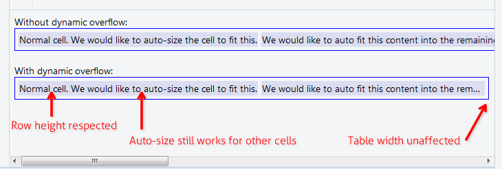
The solution below allows you to have table cell content that is long, but must not affect the width of the parent table, nor the height of the parent row. For example where you want to have a table with width:100% that still applies auto-size feature to all other cells. Useful in data grids with "Notes" or "Comment" column or something.
Add these 3 rules to your CSS:
.text-overflow-dynamic-container {
    position: relative;
    max-width: 100%;
    padding: 0 !important;
    display: -webkit-flex;
    display: -moz-flex;
    display: flex;
    vertical-align: text-bottom !important;
}
.text-overflow-dynamic-ellipsis {
    position: absolute;
    white-space: nowrap;
    overflow-y: visible;
    overflow-x: hidden;
    text-overflow: ellipsis;
    -ms-text-overflow: ellipsis;
    -o-text-overflow: ellipsis;
    max-width: 100%;
    min-width: 0;
    width:100%;
    top: 0;
    left: 0;
}
.text-overflow-dynamic-container:after,
.text-overflow-dynamic-ellipsis:after {
    content: '-';
    display: inline;
    visibility: hidden;
    width: 0;
}
Format HTML like this in any table cell you want dynamic text overflow:
<td>
  <span class="text-overflow-dynamic-container">
    <span class="text-overflow-dynamic-ellipsis" title="...your text again for usability...">
      //...your long text here...
    </span>
  </span>
</td>
Additionally apply desired min-width (or none at all) to the table cell.
Of course the fiddle: https://jsfiddle.net/9wycg99v/23/