CSS animations with Spritesheets in a grid image (not in a row)
Since this can be a difficult to debug task, I would like to start with the same problem, but in an easier to debug environment.
I chose to do it as a rectangle animation over the full image.
.hi {
    width: 320px;
    height: 315px;
    background-image: url("http://i.stack.imgur.com/CjMscm.jpg");
    position: relative;
    border: solid 1px black;
}

.hi:before {
    content: "";
    position: absolute;
    width: 100%;
    height: 53px;
    left: 0px;
    top: 0px;
    border: solid 1px red;
    -webkit-animation: playv 18s steps(6) infinite;
}

@-webkit-keyframes playv {
     0% { top:   0px; }
   100% { top: 315px; }
}

.hi:after {
    content: "";
    position: absolute;
    width: 53px;
    height: 100%;
    left: 266px;
    top: 0px;
    border: solid 1px red;
    -webkit-animation: playh 3s steps(6) infinite;
}

@-webkit-keyframes playh {
     0% { left:   0px; }
   100% { left: 320px; }
}
<div class="hi">
</div>Over the image, I display 2 pseudo elements, one is the row selector and the other the column selector. And I adjust the animations until they are ok
Now, lets verify that setting both animations at the same time works:
.hi {
    width: 320px;
    height: 315px;
    background-image: url("http://i.stack.imgur.com/CjMscm.jpg");
    position: relative;
    border: solid 1px black;
}

.hi:before {
    content: "";
    position: absolute;
    width: 53px;
    height: 53px;
    left: 0px;
    top: 0px;
    border: solid 1px red;
    -webkit-animation: playv 18s steps(6) infinite, playh 3s steps(6) infinite;
}

@-webkit-keyframes playv {
     0% { top:   0px; }
   100% { top: 315px; }
}

@-webkit-keyframes playh {
     0% { left:   0px; }
   100% { left: 320px; }
}
<div class="hi">
</div>And now the final project:
.hi {
  width: 53px;
  height: 53px;
  background-image: url("http://i.stack.imgur.com/CjMscm.jpg");
  position: relative;
  border: solid 1px black;
  -webkit-animation: playv 1s steps(6) infinite, playh 0.1667s steps(6) infinite;
  animation: playv 1s steps(6) infinite, playh 0.1667s steps(6) infinite;
}

@-webkit-keyframes playv {
  0% {
    background-position-y: 0px;
  }
  100% {
    background-position-y: -315px;
  }
}

@-webkit-keyframes playh {
  0% {
    background-position-x: 0px;
  }
  100% {
    background-position-x: -320px;
  }
}

@keyframes playv {
  0% {
    background-position-y: 0px;
  }
  100% {
    background-position-y: -315px;
  }
}

@keyframes playh {
  0% {
    background-position-x: 0px;
  }
  100% {
    background-position-x: -320px;
  }
}
<div class="hi">
</div>All this for a webkit browser, remove prefixes for IE and FF. Also, in this approach it is imposible to avoid displaying the 2 blank images at the lower left corner. If you don't have a full grid, and don't want to display the empty images, you will need to specify all the keyframes one by one
Use background-position-x and background-position-y property instead.
For this image
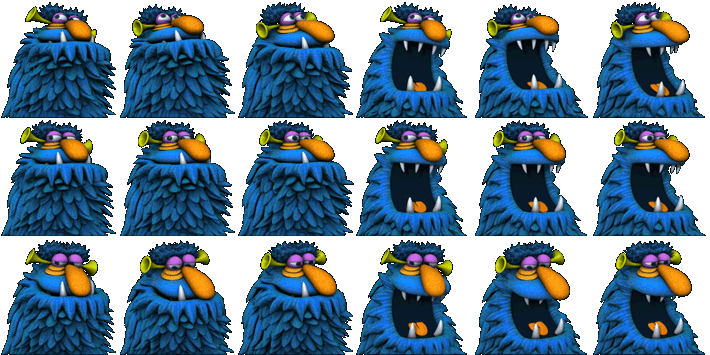
of size 710px × 355px
sprite frame size is 118.333px X 118.333px and we need to travel 6 frames horizontally and 3 frames vertically.
That means we need to create two separate keyframe animations to traverse each direction. When x direction animation is in play, other must froze until it completes.
Also duration of y animation must be 3X.
Here is code
<div class="hi"></div>


.hi {
  width: 118.333px;
  height: 118.333px;
  background-image: url("http://www.fore6.com/wp-content/uploads/2011/09/henson11-hp-1g.png");
  animation: playX 1s steps(6) infinite,
             playY 3s steps(3) infinite;
}

@keyframes playX {
  from {background-position-x: 0px;}
  to {background-position-x: -710px;}
}

@keyframes playY {
  from {background-position-y: 0px;}
  to {background-position-y: -355px;}
}
fiddle here