Creating Grid of Cards Dynamically using Angular Material 2
Well I had a similar task with creating a list of products to be displayed / filtered dynamically.
First I would suggest to create a new component which is being responsible with displaying the card.
/* Card component */
<md-card>

  <md-card-header>
    <md-card-title class="md-card-title">{{cardTitle}}</md-card-title>
  </md-card-header>

  <img md-card-image [src]="cardImagePath">

  <md-card-content>
    <div class="card-text-content">
      {{cardShortDescription}}
    </div>
  </md-card-content>

  <md-card-actions fxLayout="row" fxLayoutAlign="end center">
    <button md-button (click)="addProductToCart()">ADAUGA IN COS</button>
    <button md-button (click)="openDialog()">DETALII</button>
  </md-card-actions>

</md-card>
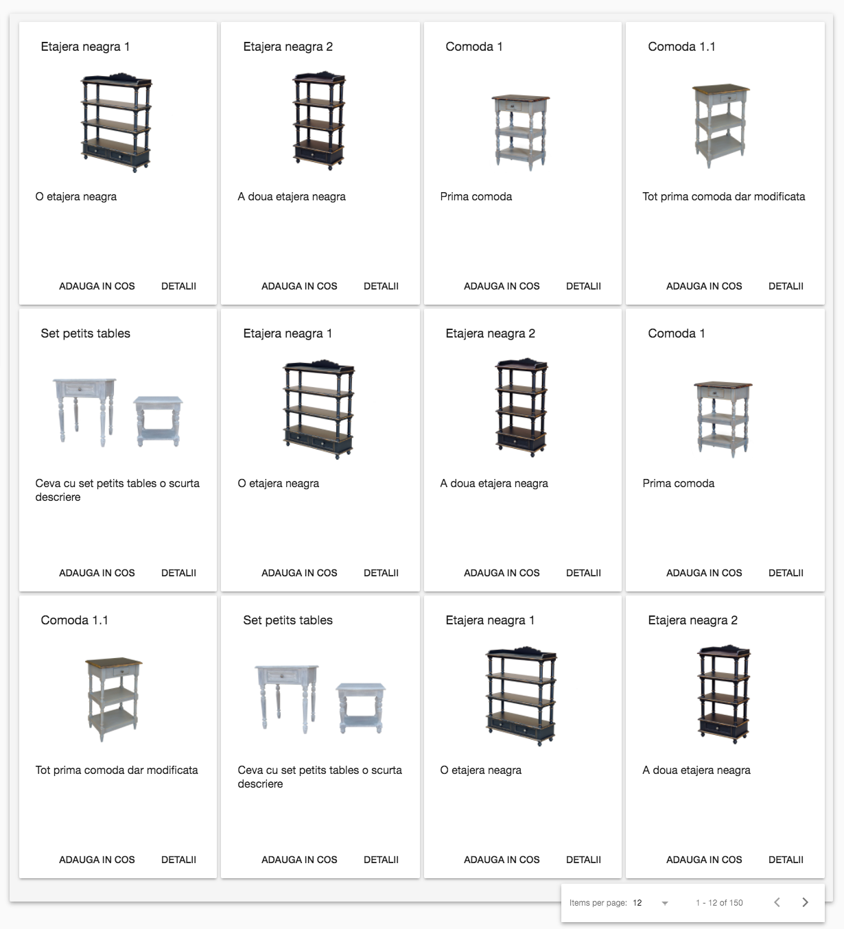
Then create a card-deck which holds the deck you want to display.
Now in order to be consistent with the number of products you want to show, and also to keep in mind that you might want to have some pagination and also cards to be responsive, you have to display a number of cards which are divided by 2, 3, 4, 6 (12 or 24) - used for cases when the card deck is responsive and you still want to have all rows displayed with cards.
/*Card deck component */
    <div fxLayout="row" fxFlex.md="70" fxLayoutWrap class="card-deck-container mat-elevation-z4">
       <div fxFlex *ngFor="let product of productsDisplayed" class="card-item">
         <app-card [ngStyle]="{'width':'300' + 'px'}" [product]="product"></app-card>
       </div>

      <div class="paginator mat-elevation-z4" *ngIf="productsDisplayed.length !== 0">
        <md-paginator
          [length]="paginatorSize"
          [pageSize]="numberOfProductsDisplayedInPage"
          [pageSizeOptions]="[12, 24]"
          (page)="updateProductsDisplayedInPage($event)">
        </md-paginator>
      </div>
  </div>
Card deck component CSS
.card-deck-container {
  width: 100%;
  max-width: 1200px;
  position: relative;
  border-radius: 2px;
  padding: 10px 10px 30px;
  margin: 10px 10px 10px 10px;
  background-color: #f5f5f5;
}

.card-item {
  padding: 3px 3px 3px 3px;
}
The main thing here is in CSS. The card deck container has a max-width of 1200px and depending on the width of each card, it will fill up the container with a maximum of 4 cards (4 cards * 300px = 1200px : one row). If the container goes smaller, the card item will go on next row (from the property of fxLayoutWrap).
I am going to post a plunker example soon. Hope this helps till then. p.s. Don't try to understand what those messages from products are saying :)
Plunker example https://plnkr.co/edit/egsNB7TLOI1HHzBgbTbP?p=preview (Use Google Chrome)
The items being displayed can be changed based on the interaction with a possible pagination component. But then you would have to keep all products/items in an array, and you would have another array with the products/items being displayed.
Hope this helps :).
Also don't forget about Angular Flex project:
- https://github.com/angular/flex-layout/wiki/Responsive-API
- https://github.com/angular/flex-layout/wiki/Declarative-API-Overview
- https://tburleson-layouts-demos.firebaseapp.com/#/responsive
I think that the most elegant solution you can afford is putting a mat-card or a custom component which use mat-card with fxFlex value inside a div or whatever element with fxLayout="row wrap like this:
<div fxLayout="row wrap">
    <mat-card *ngFor="let obj of objects" fxFlex="50">{{obj}}</mat-card>
</div>