Control the dashed border stroke length and distance between strokes
There's a cool tool made by @kovart called the dashed border generator.
It uses an svg as a background image to allow setting the stroke dash array you desire, and is pretty convenient.
You would then simply use it as the background property on your element in place of the border:
div {
  background-image: url("data:image/svg+xml,%3csvg width='100%25' height='100%25' xmlns='http://www.w3.org/2000/svg'%3e%3crect width='100%25' height='100%25' fill='none' stroke='black' stroke-width='4' stroke-dasharray='6%2c 14' stroke-dashoffset='0' stroke-linecap='square'/%3e%3c/svg%3e");
  padding: 20px;
  display: inline-block;
}
The native dashed border property value does not offer control over the dashes themselves... so bring on the border-image property!
Brew your own border with border-image
Compatibility: It offers great browser support (IE 11 and all modern browsers). A normal border can be set as a fallback for older browsers.
Let's create these
These borders will display exactly the same cross-browser!
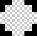
Step 1 - Create a suitable image
This example is 15 pixels wide by 15 pixels high and the gaps are currently 5px wide. It is a .png with transparency.
This is what it looks like in photoshop when zoomed in:
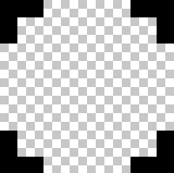
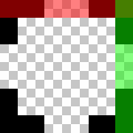
This is what it looks like to scale:

Controlling gap and stroke length
To create wider / shorter gaps or strokes, widen / shorten the gaps or strokes in the image.
Here is an image with wider 10px gaps:
 correctly scaled =
Step 2 - Create the CSS — this example requires 4 basic steps
Define the border-image-source:
border-image-source:url("http://i.stack.imgur.com/wLdVc.png");Optional - Define the border-image-width:
border-image-width: 1;The default value is 1. It can also be set with a pixel value, percentage value, or as another multiple (1x, 2x, 3x etc). This overrides any
border-widthset.Define the border-image-slice:
In this example, the thickness of the images top, right, bottom and left borders is 2px, and there is no gap outside of them, so our slice value is 2:
border-image-slice: 2;The slices look like this, 2 pixels from the top, right, bottom and left:
Define the border-image-repeat:
In this example, we want the pattern to repeat itself evenly around our div. So we choose:
border-image-repeat: round;
Writing shorthand
The properties above can be set individually, or in shorthand using border-image:
border-image: url("http://i.stack.imgur.com/wLdVc.png") 2 round;
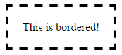
Complete example
Note the border: dashed 4px #000 fallback. Non-supporting browsers will receive this border.
.bordered {
display: inline-block;
padding: 20px;
/* Fallback dashed border
- the 4px width here is overwritten with the border-image-width (if set)
- the border-image-width can be omitted below if it is the same as the 4px here
*/
border: dashed 4px #000;
/* Individual border image properties */
border-image-source: url("http://i.stack.imgur.com/wLdVc.png");
border-image-slice: 2;
border-image-repeat: round;
/* or use the shorthand border-image */
border-image: url("http://i.stack.imgur.com/wLdVc.png") 2 round;
}
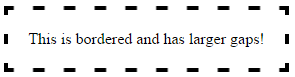
/*The border image of this one creates wider gaps*/
.largeGaps {
border-image-source: url("http://i.stack.imgur.com/LKclP.png");
margin: 0 20px;
}<div class="bordered">This is bordered!</div>
<div class="bordered largeGaps">This is bordered and has larger gaps!</div>Css render is browser specific and I don't know any fine tuning on it, you should work with images as recommended by Ham. Reference: http://www.w3.org/TR/CSS2/box.html#border-style-properties
In addition to the border-image property, there are a few other ways to create a dashed border with control over the length of the stroke and the distance between them. They are described below:
Method 1: Using SVG
We can create the dashed border by using a path or a polygon element and setting the stroke-dasharray property. The property takes two parameters where one defines the size of the dash and the other determines the space between them.
Pros:
- SVGs by nature are scalable graphics and can adapt to any container dimensions.
- Can work very well even if there is a
border-radiusinvolved. We would just have replace thepathwith acirclelike in this answer (or) convert thepathinto a circle. - Browser support for SVG is pretty good and fallback can be provided using VML for IE8-.
Cons:
- When the dimensions of the container do not change proportionately, the paths tend to scale resulting in a change in size of the dash and the space between them (try hovering on the first box in the snippet). This can be controlled by adding
vector-effect='non-scaling-stroke'(as in the second box) but the browser support for this property is nil in IE.
.dashed-vector {
  position: relative;
  height: 100px;
  width: 300px;
}
svg {
  position: absolute;
  top: 0px;
  left: 0px;
  height: 100%;
  width: 100%;
}
path{
  fill: none;
  stroke: blue;
  stroke-width: 5;
  stroke-dasharray: 10, 10;
}
span {
  position: absolute;
  top: 0px;
  left: 0px;
  padding: 10px;
}


/* just for demo */

div{
  margin-bottom: 10px;
  transition: all 1s;
}
div:hover{
  height: 100px;
  width: 400px;
}
<div class='dashed-vector'>
<svg viewBox='0 0 300 100' preserveAspectRatio='none'>
<path d='M0,0 300,0 300,100 0,100z' />
</svg>
<span>Some content</span>
</div>
<div class='dashed-vector'>
<svg viewBox='0 0 300 100' preserveAspectRatio='none'>
<path d='M0,0 300,0 300,100 0,100z' vector-effect='non-scaling-stroke'/>
</svg>
<span>Some content</span>
</div>Method 2: Using Gradients
We can use multiple linear-gradient background images and position them appropriately to create a dashed border effect. This can also be done with a repeating-linear-gradient but there is not much improvement because of using a repeating gradient as we need each gradient to repeat in only one direction.
.dashed-gradient{
  height: 100px;
  width: 200px;
  padding: 10px;
  background-image: linear-gradient(to right, blue 50%, transparent 50%), linear-gradient(to right, blue 50%, transparent 50%), linear-gradient(to bottom, blue 50%, transparent 50%), linear-gradient(to bottom, blue 50%, transparent 50%);
  background-position: left top, left bottom, left top, right top;
  background-repeat: repeat-x, repeat-x, repeat-y, repeat-y;
  background-size: 20px 3px, 20px 3px, 3px 20px, 3px 20px;
}

.dashed-repeating-gradient {
  height: 100px;
  width: 200px;
  padding: 10px;
  background-image: repeating-linear-gradient(to right, blue 0%, blue 50%, transparent 50%, transparent 100%), repeating-linear-gradient(to right, blue 0%, blue 50%, transparent 50%, transparent 100%), repeating-linear-gradient(to bottom, blue 0%, blue 50%, transparent 50%, transparent 100%), repeating-linear-gradient(to bottom, blue 0%, blue 50%, transparent 50%, transparent 100%);
  background-position: left top, left bottom, left top, right top;
  background-repeat: repeat-x, repeat-x, repeat-y, repeat-y;
  background-size: 20px 3px, 20px 3px, 3px 20px, 3px 20px;
}

/* just for demo */

div {
  margin: 10px;
  transition: all 1s;
}
div:hover {
  height: 150px;
  width: 300px;
}
<script src="https://cdnjs.cloudflare.com/ajax/libs/prefixfree/1.0.7/prefixfree.min.js"></script>
<div class='dashed-gradient'>Some content</div>
<div class='dashed-repeating-gradient'>Some content</div>Pros:
- Scalable and can adapt even if the container's dimensions are dynamic.
- Does not make use of any extra pseudo-elements which means they can be kept aside for any other potential usage.
Cons:
- Browser support for linear gradients is comparatively lower and this is a no-go if you want to support IE 9-. Even libraries like CSS3 PIE do not support creation of gradient patterns in IE8-.
- Cannot be used when
border-radiusis involved because backgrounds don't curve based onborder-radius. They get clipped instead.
Method 3: Box Shadows
We can create a small bar (in the shape of the dash) using pseudo-elements and then create multiple box-shadow versions of it to create a border like in the below snippet.
If the dash is a square shape then a single pseudo-element would be enough but if it is a rectangle, we would need one pseudo-element for the top + bottom borders and another for left + right borders. This is because the height and width for the dash on the top border will be different from that on the left.
Pros:
- The dimensions of the dash is controllable by changing the dimensions of the pseudo-element. The spacing is controllable by modifying the space between each shadow.
- A very unique effect can be produced by adding a different color for each box shadow.
Cons:
- Since we have to manually set the dimensions of the dash and the spacing, this approach is no good when the dimensions of the parent box is dynamic.
- IE8 and lower do not support box shadow. However, this can be overcome by using libraries like CSS3 PIE.
- Can be used with
border-radiusbut positioning them would be very tricky with having to find points on a circle (and possibly eventransform).
.dashed-box-shadow{
  position: relative;
  height: 120px;
  width: 120px;
  padding: 10px;
}
.dashed-box-shadow:before{ /* for border top and bottom */
  position: absolute;
  content: '';
  top: 0px;
  left: 0px;
  height: 3px; /* height of the border top and bottom */
  width: 10px; /* width of the border top and bottom */
  background: blue; /* border color */
  box-shadow: 20px 0px 0px blue, 40px 0px 0px blue, 60px 0px 0px blue, 80px 0px 0px blue, 100px 0px 0px blue, /* top border */
    0px 110px 0px blue, 20px 110px 0px blue, 40px 110px 0px blue, 60px 110px 0px blue, 80px 110px 0px blue, 100px 110px 0px blue; /* bottom border */
}
.dashed-box-shadow:after{ /* for border left and right */
  position: absolute;
  content: '';
  top: 0px;
  left: 0px;
  height: 10px; /* height of the border left and right */
  width: 3px; /* width of the border left and right */
  background: blue; /* border color */
  box-shadow: 0px 20px 0px blue, 0px 40px 0px blue, 0px 60px 0px blue, 0px 80px 0px blue, 0px 100px 0px blue, /* left border */
    110px 0px 0px blue, 110px 20px 0px blue, 110px 40px 0px blue, 110px 60px 0px blue, 110px 80px 0px blue, 110px 100px 0px blue; /* right border */
}
<div class='dashed-box-shadow'>Some content</div>