Center text over an image in flexbox
You can just wrap an image with relatively positioned inline-block <div> and give the text this way:
* {margin: 0; padding: 0; list-style: none;}
.img-holder {position: relative; display: inline-block;}
.img-holder img {display: block;}
.img-holder p {position: absolute; top: 50%; left: 0; right: 0; transform: translate(0, -50%); text-align: center; color: #fff; text-shadow: 0 0 15px;}
<div class="img-holder">
<img src="http://bit.ly/1YrRsis" alt="">
<p>Text Aligned Centrally Vertical & Horizontal.</p>
</div>Now the <div> is an inline kinda element that you can style.
Preview:

I've added another wrapper div surrounding the img and text as well as using flex to position the text. See this codepen
HTML:
<section class="height-100vh center-aligned">
  <div class="wrapper">
    <img class="background-image" src="http://bit.ly/1YrRsis" />
    <div class="text">SOME TEXT</div>
  </div>
</section>
CSS:
@import "bourbon";

body {
  margin: 0px;
}

.height-100vh {
  height: 100vh;
}

.center-aligned {
  @include display(flex);
  @include align-items(center);
  @include justify-content(center);
}

.wrapper {
  position: relative;
}

.text {
  justify-content: center;
  align-items: center;
  display: flex;
  color: #fff;
  position: absolute;
  top: 0;
  left: 0;
  right: 0;
  bottom: 0;
}
To center text over an image you don't need flexbox. Just use CSS positioning properties.
.height-100vh {
    height: 100vh;
    position: relative;               /* establish nearest positioned ancestor for
                                         absolute positioning */
}

.text {
    position: absolute;
    left: 50%;                        /* horizontal alignment */
    top: 50%;                         /* vertical alignment */
    transform: translate(-50%, -50%); /* precise centering; see link below */
}
body {
  margin: 0px;
}

.height-100vh {
  height: 100vh;
  display: flex;           /* establish flex container */
  flex-direction: column;  /* stack flex items vertically */
  position: relative;      /* establish nearest positioned ancenstor for absolute positioning */
}

.text {
  position: absolute;
  left: 50%;
  top: 50%;
  transform: translate(-50%, -50%);
  color: white;
  font-weight: bold;
}

.center-aligned {
  display: flex;
  align-items: center;
  justify-content: center;
}
<section class="height-100vh center-aligned">
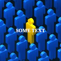
<img class="background-image" src="http://vignette2.wikia.nocookie.net/uncyclopedia/images/f/f8/Stand-out-in-the-crowd-300x300.jpg/revision/latest?cb=20090904155448" />
<div class="text">SOME TEXT</div>
</section>Revised Codepen
The code above centers the text both vertically and horizontally over the image:
For a more detailed explanation of the centering method see:
- Element will not stay centered, especially when re-sizing screen
You also can center align text onto an image using display: inline-block; to the wrapper element.
.height-100vh {
  display: inline-block;
  position: relative;
}
.text {
  position: absolute;
  left: 50%;
  top: 50%;
  transform: translate(-50%, -50%);
  color: #fff;
}
<section class="height-100vh center-aligned">
<img class="background-image" src="http://vignette2.wikia.nocookie.net/uncyclopedia/images/f/f8/Stand-out-in-the-crowd-300x300.jpg" />
<div class="text">SOME TEXT</div>
</section>