Can I have a varying number of columns per row in a CSS grid?
You can solve this with having nested grids. Grid-1 (covers complete area) Grid-2 (covers row-1) Grid-3 (covers row-2)
By having this setting you can shorten the width of row-2.
You're asking this:
Can I have a varying number of columns per row in a CSS Grid?
But then you're saying this:
Is this possible via CSS Grid/Flexbox to horizontally center 2 columns in the 2nd row?
It looks like you're stuck in a classic XY Problem: You're focusing on your attempted solution rather than your actual problem.
Yes, it is possible to center columns (and grid items, and content) in CSS Grid. (See various methods here: Centering in CSS Grid)
No, it's not possible to have a varying number of columns per row in a CSS Grid, or any grid for that matter. Otherwise, you don't have a grid.
Since appearance is often all that matters in a layout, you can build something that looks like three "columns" in the first row and two "columns" in the second row – centered – using CSS Grid.
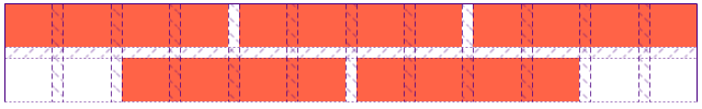
In my example below, I've divided the horizontal space in the grid container among 12 columns. I've then used Grid's line-based placement features to position and size the items.
.grid {
  display: grid;
  grid-template-columns: repeat(12, 1fr);
  grid-auto-rows: 40px;
  grid-gap: 10px;
}

.col:nth-child(-1n + 3) {
  grid-column: span 4;
}
.col:nth-last-child(2) {
  grid-row-start: 2;
  grid-column: 3 / span 4;
}
.col:nth-last-child(1) {
  grid-row-start: 2;
  grid-column: 7 / span 4;
}
.col {
  background-color: tomato;
}
<div class="grid">
<div class="col"></div>
<div class="col"></div>
<div class="col"></div>
<div class="col"></div>
<div class="col"></div>
</div>codepen demo
Here's what it looks like using Firefox DevTools:
You could always try it this way:
.container {
  display: grid;
  grid-gap: 10px;
  grid-template-columns: [col] 100px [col] 100px [col] 100px [col] 100px;
  grid-template-rows: [row] auto [row] auto [row];
  background-color: #fff;
  color: #444;
}

.col {
  background-color: #444;
  color: #fff;
  border-radius: 5px;
  padding: 20px;
  font-size: 150%;
}

.a {
  grid-column: col / span 2;
  grid-row: row;
}

.b {
  grid-column: col 3 / span 2;
  grid-row: row;
}

.c {
  grid-column: col;
  grid-row: row 2;
}

.d {
  grid-column: col 2 / span 3;
  grid-row: row 2;
}

.e {
  grid-column: col / span 4;
  grid-row: row 3;
}
<div class="container">
<div class="col a">A</div>
<div class="col b">B</div>
<div class="col c">C</div>
<div class="col d">D</div>
<div class="col e">E</div>
</div>CodePen: https://codepen.io/anon/pen/MOLrvq
If your rows have varying numbers of cells that aren't all laid out on a single two-dimensional (row and column) space, you don't have a grid. A grid by definition contains a fixed number of rows and columns, and cells that span one or more of each. Maybe you'd have multiple heterogeneous grids, one per row, but that just defeats the whole point of grids, really.
If your varying number of rows is symmetrical or follows some kind of pattern, you can follow Michael_B's suggestion of building a grid based on a common denominator and populating the grid areas mosaic-style. This is just about as non-trivial as a flexbox solution currently would be, but once more browsers implement flexbox fragmentation, flexbox should become the obvious choice over grid as it ought to be.