Bootstrap mobile menu icon change to x close
Your JavaScript replaces the inner html of the #ChangeToggle element to show either the X or the hamburger icon. Precisely clicking on the X or the hamburger menu instead of the #ChangeToggle will remove the element being clicked on which I think prevents it from bubbling up. As Bootstrap's collapse plugin uses an event handler on the document to determine if an element has been clicked, the collapse plugin will never get notified.
I've created a small example where a click handler on the pink .outer area replaces the green .inner area. Note that clicking on the pink area (your #ChangeToggle) will lead to two events, where clicking on the green area (your X icon) will lead to a single event.
$(function() {
  $('.outer')
    .click(function() {
      $('.outer').html('<div class="inner"></div>');
      fired('.js-outer');
    });

  $(document).on('click', '.outer', function() {
    fired('.js-document');
  });
});

function fired(el) {
  $(el).addClass('event--fire');
  window.setTimeout(function() {
    $(el).removeClass('event--fire')
  }, 100);
}
body {
font-family: Helvetica Neue, Helvetica, Arial;
}
.outer,
.inner {
display: inline-block;
padding: 20px;
}
.outer {
border: 1px solid #c66;
background-color: #f99;
}
.inner {
border: 1px solid #6c6;
background-color: #9f9;
}
.event {
margin: 10px 0;
}
.event::before {
display: inline-block;
content: '';
border: 1px solid #ccc;
padding: 10px;
vertical-align: middle;
margin-right: 10px;
}
.event--fire:before {
background-color: #ff9;
}<script src="//code.jquery.com/jquery-1.11.0.min.js"></script>
<div class="outer">
<div class="inner">
</div>
</div>
<div class="event js-outer">Event fires on .outer</div>
<div class="event js-document">Event fires on document</div>The easiest way to solve this issue for your navigation bar is to hide/show the X or hamburger icon instead of replacing. In the example below both the X and the hamburger icon are in the html, and toggling the class .hidden is used to show the correct icon.
$(function() {
  $('#ChangeToggle').click(function() {
    $('#navbar-hamburger').toggleClass('hidden');
    $('#navbar-close').toggleClass('hidden');
  });
});
<link href="//maxcdn.bootstrapcdn.com/bootstrap/3.3.2/css/bootstrap.min.css" rel="stylesheet" />
<script src="//code.jquery.com/jquery-1.11.0.min.js"></script>
<script src="//maxcdn.bootstrapcdn.com/bootstrap/3.3.2/js/bootstrap.min.js"></script>
<nav class="navbar navbar-default">
<div class="container-fluid">
<!-- Brand and toggle get grouped for better mobile display -->
<div class="navbar-header">
<button id="ChangeToggle" type="button" class="navbar-toggle collapsed" data-toggle="collapse" data-target="#bs-example-navbar-collapse-1">
<div id="navbar-hamburger">
<span class="sr-only">Toggle navigation</span>
<span class="icon-bar"></span>
<span class="icon-bar"></span>
<span class="icon-bar"></span>
</div>
<div id="navbar-close" class="hidden">
<span class="glyphicon glyphicon-remove"></span>
</div>
</button>
<a class="navbar-brand" href="#">Brand</a>
</div>
<div class="collapse navbar-collapse" id="bs-example-navbar-collapse-1">
<ul class="nav navbar-nav">
<li class="active"><a href="#">Link <span class="sr-only">(current)</span></a>
</li>
</ul>
</div>
</div>
</nav>Instead of adding a jQuery click handler next to Bootstrap's collapse plugin, you could also use the events fired by the collapse plugin to hide or show the correct icon. Use the shown.bs.collapse event to show the X icon, and the hidden.bs.collapse event to show the hamburger icon.
$(function() {

  $('#bs-example-navbar-collapse-1')
    .on('shown.bs.collapse', function() {
      $('#navbar-hamburger').addClass('hidden');
      $('#navbar-close').removeClass('hidden');
    })
    .on('hidden.bs.collapse', function() {
      $('#navbar-hamburger').removeClass('hidden');
      $('#navbar-close').addClass('hidden');
    });

});
#navbar-close {
color: #888;
width: 22px;
height: 14px;
}<link href="//maxcdn.bootstrapcdn.com/bootstrap/3.3.2/css/bootstrap.min.css" rel="stylesheet" />
<script src="//code.jquery.com/jquery-1.11.0.min.js"></script>
<script src="//maxcdn.bootstrapcdn.com/bootstrap/3.3.2/js/bootstrap.min.js"></script>
<nav class="navbar navbar-default">
<div class="container-fluid">
<!-- Brand and toggle get grouped for better mobile display -->
<div class="navbar-header">
<button id="ChangeToggle" type="button" class="navbar-toggle collapsed" data-toggle="collapse" data-target="#bs-example-navbar-collapse-1">
<div id="navbar-hamburger">
<span class="sr-only">Toggle navigation</span>
<span class="icon-bar"></span>
<span class="icon-bar"></span>
<span class="icon-bar"></span>
</div>
<div id="navbar-close" class="hidden">
<span class="glyphicon glyphicon-remove"></span>
</div>
</button>
<a class="navbar-brand" href="#">Brand</a>
</div>
<div class="collapse navbar-collapse" id="bs-example-navbar-collapse-1">
<ul class="nav navbar-nav">
<li class="active"><a href="#">Link <span class="sr-only">(current)</span></a>
</li>
</ul>
</div>
</div>
</nav>This worked for me
Theory
CSS provides all the necessary animation tools. Basically what's happening is this:
- The top and bottom lines must rotate to form the X
- The middle line must disappear
The X will be taller an more narrow than the hamburger lines, so:
- The top and middle lines must move out vertically and to the right to maintain its center
Application
/* Define the shape and color of the hamburger lines */
.navbar-toggler span {
    display: block;
    background-color: #4f4f4f;
    height: 3px;
    width: 25px;
    margin-top: 5px;
    margin-bottom: 5px;
    position: relative;
    left: 0;
    opacity: 1;
    transition: all 0.35s ease-out;
    transform-origin: center left;
}


/* top line needs a little padding */
.navbar-toggler span:nth-child(1) {
    margin-top: 0.3em;
}

/**
 * Animate collapse into X.
 */

/* top line rotates 45 degrees clockwise and moves up and in a bit to close the center of the X in the center of the button */
.navbar-toggler:not(.collapsed) span:nth-child(1) {
    transform: translate(15%, -33%) rotate(45deg);
}
/* center line goes transparent */
.navbar-toggler:not(.collapsed) span:nth-child(2) {
    opacity: 0;
}
/* bottom line rotates 45 degrees counter clockwise, in, and down a bit to close the center of the X in the center of the button  */
.navbar-toggler:not(.collapsed) span:nth-child(3) {
    transform: translate(15%, 33%) rotate(-45deg) ;
}


/**
 * Animate collapse open into hamburger menu
 */

/* top line moves back to initial position and rotates back to 0 degrees */
.navbar-toggler span:nth-child(1) {
    transform: translate(0%, 0%) rotate(0deg) ;
}
/* middle line goes back to regular color and opacity */
.navbar-toggler span:nth-child(2) {
    opacity: 1;
}
/* bottom line goes back to initial position and rotates back to 0 degrees */
.navbar-toggler span:nth-child(3) {
    transform: translate(0%, 0%) rotate(0deg) ;
}
<script src="https://code.jquery.com/jquery-3.5.1.slim.min.js"></script>
<script src="https://stackpath.bootstrapcdn.com/bootstrap/4.5.2/js/bootstrap.min.js"></script>
<link href="https://stackpath.bootstrapcdn.com/bootstrap/4.5.2/css/bootstrap.min.css" rel="stylesheet"/>
<!-- Bootstrap Navigation -->
<nav class="navbar bg-light">
<a class="navbar-toggler collapsed border-0" type="button" data-toggle="collapse" data-target="#collapsingNavbar">
<!-- these spans become the three lines -->
<span> </span>
<span> </span>
<span> </span>
</a>
<a class="navbar-brand" href="./">
Brand
</a>
<div class="collapse navbar-collapse" id="collapsingNavbar">
<ul class="nav navbar-nav">
<li class="nav-item">
<a class="nav-link" href="#">About</a>
</li>
<li class="nav-item">
<a class="nav-link" href="#">Contact</a>
</li>
</ul>
</div>
</nav>
<main class="container">
<h1>Content Here</h1>
<p>Shrink the viewport if to expose the hamburger menu.</p>
</main>What makes it work
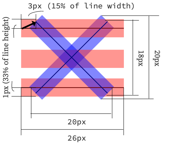
Specifically, since the top and bottom lines rotate by 45 degrees to form the X, their center lines take up 70% of the width, so they must move in by 15%. This can be calculated using pythagorean theorem.

As it happens, our hamburger menu is 26x21 px, or 24% wider than it is tall, but the X ends up being 20x20 square when you move the lines into place and you take into account the height of the lines (here defined as 3px).
In this particular implementation, we are defining the point of rotation of each line as being the center-left. This affects how much we move the lines up, since the lines are about 3px tall, they each add about (2.1/2)=1.05px to the height of the X, or about 33% of the height of the X.
Therefore 33% is how much they must move out vertically out so the two lines meet at the center of the X and form a 20x20px square.
Customizing
The X will always make a square, so to find out how much to move them by, you just need to know the width and height of your <span> bars and the height of the resulting hamburger icon.
Plug those numbers into this equation:
Or in code:
const line_width = 26; // px
const line_height = 3; // px
const hamburger_height = 21; // px

const x_width = x_height = 0.8 * line_width;
const line_move_y_percent = 100 * (line_width - x_width) / (2 * line_height)
const line_move_right_percent = 100 * (x_height - hamburger_height) / (2 * line_height)