Bootstrap combining rows (rowspan)
Check this one. hope it will help full for you.
http://jsfiddle.net/j6amM/
.row-fix { margin-bottom:20px;}

.row-fix > [class*="span"]{ height:100px; background:#f1f1f1;}

.row-fix .two-col{ background:none;}

.two-col > [class*="col"]{ height:40px; background:#ccc;}

.two-col > .col1{margin-bottom:20px;}
Note: This was for Bootstrap 2 (relevant when the question was asked).
You can accomplish this by using row-fluid to make a fluid (percentage) based row inside an existing block.
<div class="row">
   <div class="span5">span5</div>
   <div class="span3">span3</div>
   <div class="span2">
      <div class="row-fluid">
         <div class="span12">span2</div>
         <div class="span12">span2</div>
      </div>
   </div>
   <div class="span2">span2</div>
</div>
<div class="row">
   <div class="span6">
      <div class="row-fluid">
         <div class="span12">span6</div>
         <div class="span12">span6</div>
      </div>
   </div>
   <div class="span6">span6</div>
</div>
Here's a JSFiddle example.
I did notice that there was an odd left margin that appears (or does not appear) for the spans inside of the row-fluid after the first one. This can be fixed with a small CSS tweak (it's the same CSS that is applied to the first child, expanded to those past the first child):
.row-fluid [class*="span"] {
    margin-left: 0;
}
Divs stack vertically by default, so there is no need for special handling of "rows" within a column.
div {
  height:50px;
}
.short-div {
  height:25px;
}
<link href="https://maxcdn.bootstrapcdn.com/bootstrap/3.3.6/css/bootstrap.min.css" rel="stylesheet" />
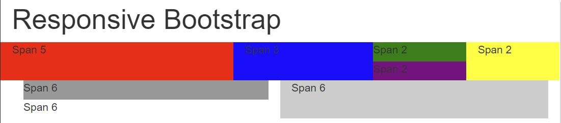
<div class="container">
<h1>Responsive Bootstrap</h1>
<div class="row">
<div class="col-lg-5 col-md-5 col-sm-5 col-xs-5" style="background-color:red;">Span 5</div>
<div class="col-lg-3 col-md-3 col-sm-3 col-xs-3" style="background-color:blue">Span 3</div>
<div class="col-lg-2 col-md-2 col-sm-3 col-xs-2" style="padding:0px">
<div class="short-div" style="background-color:green">Span 2</div>
<div class="short-div" style="background-color:purple">Span 2</div>
</div>
<div class="col-lg-2 col-md-2 col-sm-3 col-xs-2" style="background-color:yellow">Span 2</div>
</div>
</div>
<div class="container-fluid">
<div class="row-fluid">
<div class="col-lg-6 col-md-6 col-sm-6 col-xs-6">
<div class="short-div" style="background-color:#999">Span 6</div>
<div class="short-div">Span 6</div>
</div>
<div class="col-lg-6 col-md-6 col-sm-6 col-xs-6" style="background-color:#ccc">Span 6</div>
</div>
</div>Output:
Here's the fiddle.
You should use bootstrap column nesting.
See Bootstrap 3 or Bootstrap 4:
<div class="row">
    <div class="col-md-5">Span 5</div>
    <div class="col-md-3">Span 3<br />second line</div>
    <div class="col-md-2">
        <div class="row">
            <div class="col-md-12">Span 2</div>
        </div>
        <div class="row">
            <div class="col-md-12">Span 2</div>
        </div>
    </div>
    <div class="col-md-2">Span 2</div>
</div>
<div class="row">
    <div class="col-md-6">
        <div class="row">
            <div class="col-md-12">Span 6</div>
            <div class="col-md-12">Span 6</div>
        </div>
    </div>
    <div class="col-md-6">Span 6</div>
</div>
http://jsfiddle.net/DRanJ/125/
(In Fiddle screen, enlarge your test screen to see the result, because I'm using col-md-*, then responsive stacks columns)
Note: I am not sure that BS2 allows columns nesting, but in the answer of Paul Keister, the columns nesting is not used. You should use it and avoid to reinvente css while bootstrap do well.
The columns height are auto, if you add a second line (like I do in my example), column height adapt itself.