Bootstrap add focus and validation states to input-group-addon, not just input
Unfortunately, I couldn't figure out a way to do it without javascript. But here's a solution.
Add this CSS:
.input-group-focus {
  border-radius:4px;
  -webkit-transition: box-shadow ease-in-out .15s;
          transition: box-shadow ease-in-out .15s;
}
.input-group-addon {
  -webkit-transition: border-color ease-in-out .15s;
          transition: border-color ease-in-out .15s;
}
.input-group.input-group-focus {
  -webkit-box-shadow: inset 0 1px 1px rgba(0,0,0,.075), 0 0 8px rgba(102, 175, 233, .6) !important;
          box-shadow: inset 0 1px 1px rgba(0,0,0,.075), 0 0 8px rgba(102, 175, 233, .6) !important;
}
.has-error.input-group.input-group-focus,
.has-error .input-group.input-group-focus {
  -webkit-box-shadow: inset 0 1px 1px rgba(0, 0, 0, .075), 0 0 6px #ce8483 !important;
          box-shadow: inset 0 1px 1px rgba(0, 0, 0, .075), 0 0 6px #ce8483 !important;
}
.has-warning.input-group.input-group-focus,
.has-warning .input-group.input-group-focus {
  -webkit-box-shadow: inset 0 1px 1px rgba(0, 0, 0, .075), 0 0 6px #67b168 !important;
          box-shadow: inset 0 1px 1px rgba(0, 0, 0, .075), 0 0 6px #67b168 !important;
}
.has-success .input-group.input-group-focus,
.has-success .input-group.input-group-focus {
  -webkit-box-shadow: inset 0 1px 1px rgba(0, 0, 0, .075), 0 0 6px #c0a16b !important;
          box-shadow: inset 0 1px 1px rgba(0, 0, 0, .075), 0 0 6px #c0a16b !important;
}
.input-group-focus input:focus {
  -webkit-box-shadow: none !important;
          box-shadow: none !important;
}
.input-group-focus .input-group-addon {
  border-color: #66afe9 !important;
}
.has-error .input-group-addon {
  border-color: #843534 !important;
}
.has-success .input-group-addon {
  border-color: #2b542c !important;
}
.has-warning .input-group-addon {
  border-color: #66512c !important;
}
The !important's may or may not be necessary for your implementation, so I decided to leave them there. I don't think there's a scenario where something is more important than your focus state, so it should be okay.
And the JS (uses jQuery):
$(document).ready(function() {
    $(".input-group > input").focus(function(e){
        $(this).parent().addClass("input-group-focus");
    }).blur(function(e){
        $(this).parent().removeClass("input-group-focus");
    });
});
This will work whether you add validation states to the .input-group parent or the .form-group parent.
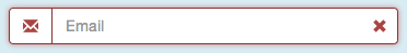
The resulting effect:

I don't really like using JQuery these days at the best of times, and find javascript solutions can become a hard to support (happy to be corrected :)
From what we know with CSS the + operator will apply rules to the very next child selector or we can use ~ to target any child selector. (It is annoying there's no parent selector)
With this in mind my solution (only tested with Chrome and not with the .has-success, .has-errors etc states on .form-group) is to over lay a modified copy of the .input-group block, nested within it self.
The base block would be something like:
<div class="form-group">
    <label class="control-label">Input with addons</label>
        <div class="input-group">
            <div class="input-group-addon">$</div>
            <input type="text" class="form-control" placeholder="placeholder text">
            <div class="input-group-addon">.00</div>
        </div>
    <span class="help-block">Help block</span>
</div>
The modified / duplicate block (which is added / inserted just after the input field in the above code):
<div class="input-group-overlay">
    <div class="input-group-addon">$</div>
    <span class="form-control"></span>
    <div class="input-group-addon">.00</div>
</div>
The complete block now looks like:
<div class="form-group">
    <label class="control-label">Input with addons</label>
        <div class="input-group">
            <div class="input-group-addon">$</div>
            <input type="text" class="form-control" placeholder="placeholder text">
            <div class="input-group-overlay">
                <div class="input-group-addon">$</div>
                <span class="form-control"></span>
                <div class="input-group-addon">.00</div>
            </div>
            <div class="input-group-addon">.00</div>
        </div>
    <span class="help-block">Help block</span>
</div>
The block needs to go before the last input-group-addon if there's appended elements otherwise the top and bottom right radius corners won't be applied. I've also used + as the operator in the below CSS, which expects it to be the very next element.
Now the CSS:
input:focus + .input-group-overlay .input-group-addon {
  border-color: #66afe9;
}

.input-group-overlay {
  position: absolute;
  display: inherit;
  z-index: 1;
  top: 0;
  left: 0;
}
This will apply the border to the child input addon's that over lap the the parent elements.
As stated at the top, this has only been tested in Chrome, the z-index for the span .form-group might need some tweaking in other browsers.
Added bounce, you can also remove the left and right borders of the input to and change the background colour of the addons to make them look like part of the input its self.
.input-group .form-control {
  border-left: 0;
  border-right: 0;
}

.input-group-addon {
  background: #fff;
}
Depicted above, my solution (using Bootstrap 4) is to overlap the input-group-addon on top of the input with absolute positioning and z-index. I add some right padding to the input to make room for the addon. Here's my SCSS and markup:
.input-group.input-group-seamless-append {
    > input {
        width: 100%;
        padding-right: 52px;
    }
    > .input-group-append {
        position: absolute;
        right: 1px;
        top: 1px;
        bottom: 1px;
        z-index: 4;
    }
}
<div class="input-group input-group-seamless-append">
<input autocomplete="off" class="form-control rounded"
aria-describedby="button-addon"
[attr.type]="showPassword ? 'text' : 'password'">
<div class="input-group-append">
<button type="button" id="button-addon"
class="btn btn-light shadow-none border-0 bg-transparent text-primary">
<i class="fa fa-eye" *ngIf="showPassword"
(click)="showPassword = !showPassword"></i>
<i class="fa fa-eye-slash" *ngIf="!showPassword"
(click)="showPassword = !showPassword"></i>
</button>
</div>
</div>You can see this special UX is activated by adding the class input-group-seamless-append to my input-group, so I can control specific places it is applied.
If you're not using Angular you'll need to remove the (click), *ngIf, and [attr] bindings, those are specific to show/hide password functionality.
Here's what it ends up looking like:
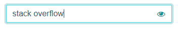
Unfocused:
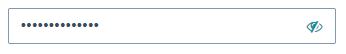
Focused:
Here is how I managed to do this just by CSS
.input-group:focus-within .input-group-prepend .input-group-text,
.form-control:focus ~ .input-group-append .input-group-text {
  border-color: #06f;
}