Bootstrap 4 - hide on xs and sm not working
It's because you should use d-none instead of d-flex.
<div class="container">
    <div class="row">
        <div class="col-lg-6 col-md-4 col-sm-5">Produkt</div>
        <div class="col-2 d-none d-md-flex justify-content-start">Cena</div>
        <div class="col-lg-2 col-md-3 col-sm-4 d-flex justify-content-center">Ilość</div>
        <div class="col-lg-2 col-sm-3 d-flex justify-content-end">Wartość</div>
    </div>
</div>
https://codeply.com/go/XUSWoSdFcP
Related:
Missing visible-** and hidden-** in Bootstrap v4
For Bootstrap 4.0 and above:
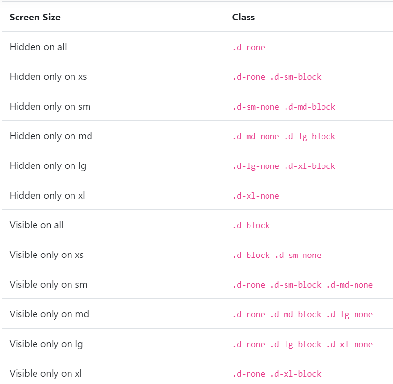
Documentation: https://getbootstrap.com/docs/4.3/utilities/display/
Additional information:
- Hidden only for screen size sm and smaller(like xs) or Visible only for screen size md and larger(like lg): d-none d-md-block
- Visible only for screen size sm and smaller(like xs) or Hidden only for screen size md and larger(like lg): d-block d-md-none