Bootstrap 4.1 floating labels
It says on the Bootstrap examples page that floating-labels are...
"Experiments - Examples that focus on future-friendly features or techniques."
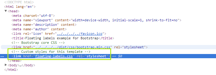
Like many of the other examples, there's an additional CSS file used in the example...
Using the floating-labels.css they work as expected in the supported browsers...
https://www.codeply.com/go/X9VbHqzD4B
If you really want floating label, see this awesome Bootstrap 4 theme : http://djibe.github.io/material/docs/4.4/material/text-fields/
Styles they ware using in that mentioned example site
:root {
  --input-padding-x: .75rem;
  --input-padding-y: .75rem;
}

html,
body {
  height: 100%;
}

body {
  display: -ms-flexbox;
  display: -webkit-box;
  display: flex;
  -ms-flex-align: center;
  -ms-flex-pack: center;
  -webkit-box-align: center;
  align-items: center;
  -webkit-box-pack: center;
  justify-content: center;
  padding-top: 40px;
  padding-bottom: 40px;
  background-color: #f5f5f5;
}

.form-signin {
  width: 100%;
  max-width: 420px;
  padding: 15px;
  margin: 0 auto;
}

.form-label-group {
  position: relative;
  margin-bottom: 1rem;
}

.form-label-group > input,
.form-label-group > label {
  padding: var(--input-padding-y) var(--input-padding-x);
}

.form-label-group > label {
  position: absolute;
  top: 0;
  left: 0;
  display: block;
  width: 100%;
  margin-bottom: 0; /* Override default `<label>` margin */
  line-height: 1.5;
  color: #495057;
  border: 1px solid transparent;
  border-radius: .25rem;
  transition: all .1s ease-in-out;
}

.form-label-group input::-webkit-input-placeholder {
  color: transparent;
}

.form-label-group input:-ms-input-placeholder {
  color: transparent;
}

.form-label-group input::-ms-input-placeholder {
  color: transparent;
}

.form-label-group input::-moz-placeholder {
  color: transparent;
}

.form-label-group input::placeholder {
  color: transparent;
}

.form-label-group input:not(:placeholder-shown) {
  padding-top: calc(var(--input-padding-y) + var(--input-padding-y) * (2 / 3));
  padding-bottom: calc(var(--input-padding-y) / 3);
}

.form-label-group input:not(:placeholder-shown) ~ label {
  padding-top: calc(var(--input-padding-y) / 3);
  padding-bottom: calc(var(--input-padding-y) / 3);
  font-size: 12px;
  color: #777;
}