Blazor template with menu across the top
I just went through the same thing yesterday. Very frustrating. I was able to get rid of the sidebar and put the menu on top. Unfortunately, after I did that, in small devices, when the menu is expanded after clicking the toggle button, the brand, toggle button and menu were all vertically centered on the expanded area, where one expects only the menu items to appear. The brand and the toggle button should remain on the top row.
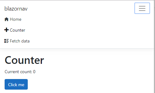
Expanded menu
This morning, I came across a post (https://www.nativoplus.studio/blog/blazor-layouts/) that suggests the bootstrap css included in the Blazor template is modified. To get the default behavior, you need to comment it (and the site.css) out of _Host.cshtml and replace it with the official bootstrap css file.
When I did that, the menu began working almost correctly. The weird format went away. My problem now is that on small devices, after making a menu selection, the menu does not collapse. I'm assuming it has to do with the way Blazor handles UI changes. In other words, since the menu content didn't change after making the selection, it doesn't re-render the menu.
If I come up w a way to collapse the menu, I'll post it here.
The sidebar in Blazor isn't something special. If you check MainLayout.razor you'll see a reference to a NavMenu component with the sidebar class :
<div class="sidebar">
    <NavMenu />
</div>
If you open NavMenu.razor you'll see it's just a Bootstrap Navbar, conveniently packed in a reusable component.
Update
Blazor uses Bootstrap which makes the rest of the problem a stylesheet problem, not a Blazor issue.
The Blazor template's stylesheet was built for this specific Explorer-like layout - a vertical navbar on the left, the main area on the right. The colors, sizes and most importantly, flow, are designed for this. It's not enough to modify a single style class.
On the other hand, the Razor pages stylesheet was built for the "classic" Bootstrap look with the menu on top, containers and rows in the middle, footers and headers. This means, we can "borrow" the stylesheet and layout from a new Razor Pages application.
- Create a new project with
dotnet new webapp - Remove everything in Blazor's
site.cssexcept the first line :
@import url('open-iconic/font/css/open-iconic-bootstrap.min.css');
- Copy the contents of Razor's
site.cssto Blazor'ssite.css. The file should look like this :
@import url('open-iconic/font/css/open-iconic-bootstrap.min.css');

a.navbar-brand {
    white-space: normal;
    text-align: center;
    word-break: break-all;
  }
...
- Modify Blazor's
Shared\MainLayout.razorto mimic the structure in Razor'sShared\_Layout.cshtml:
@inherits LayoutComponentBase


<header>
  <NavMenu />
</header>

<div class="container">
    <main role="main" class="pb-3">
        @Body
    </main>
</div>
No footer here since there's no Privacy page in the Blazor template.
- Modify
Shared\NavMenu.razorto use the structure and styles of the Razor template.<a>elements need to be replaged byNavLinkelements. The other tricky part is that the toggler in Razor works through thedata-toggle="collapse" data-targetattributes which don't work in Blazor. That's why the click handler is needed :
<nav class="navbar navbar-expand-sm navbar-toggleable-sm navbar-light bg-white border-bottom box-shadow mb-3">
    <div class="container">
        <a class="navbar-brand" href="">blazornav</a>
        <button class="navbar-toggler" type="button" @onclick="ToggleNavMenu">
            <span class="navbar-toggler-icon"></span>
        </button>
        <div class="@NavMenuCssClass"  @onclick="ToggleNavMenu">
            <ul class="navbar-nav flex-grow-1">
                <li class="nav-item">
                    <NavLink class="nav-link text-dark" href="" Match="NavLinkMatch.All">
                        <span class="oi oi-home" aria-hidden="true"></span> Home
                    </NavLink>
                </li>
                <li class="nav-item">
                    <NavLink class="nav-link text-dark" href="counter">
                        <span class="oi oi-plus" aria-hidden="true"></span> Counter
                    </NavLink>
                </li>
                <li class="nav-item">
                    <NavLink class="nav-link text-dark" href="fetchdata">
                        <span class="oi oi-list-rich" aria-hidden="true"></span> Fetch data
                    </NavLink>
                </li>
            </ul>
        </div>
    </div>
</nav>
The click handler simply adds or removes the collapse class to the base navbar style copied from Razor
@code {
    bool collapseNavMenu = true;

    string baseMenuClass = "navbar-collapse d-sm-inline-flex flex-sm-row-reverse";

    string NavMenuCssClass => baseMenuClass + (collapseNavMenu ? " collapse" : "");

    void ToggleNavMenu()
    {
        collapseNavMenu = !collapseNavMenu;
    }
}
This results in a horizontal menu with a toggler on the right: