Avoid elliptical shape in CSS border-radius
(source: mozilla.org)
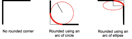
Formally, the syntax for the border-radius property accepts 2 values for each corner: a horizontal radius and a vertical radius (separated by a slash). The following line would create an elliptical border-radius similar to the third image above.
border-radius: 10px / 5px;
Usually, we only specify one value. In this case, that value gets used as both the vertical and horizontal radii. The following line would create a circular border-radius similar to the second image above.
border-radius: 10px;
Using Percentages
The Mozilla Developer's Network defines the possible value types for this property as follows:
<length>
Denotes the size of the circle radius or the semi-major and semi-minor axes of the ellipsis. It can be expressed in any unit allowed by the CSS data types. Negative values are invalid.<percentage>
Denotes the size of the circle radius, or the semi-major and semi-minor axes of the ellipsis, using percentage values. Percentages for the horizontal axis refer to the width of the box, percentages for the vertical axis refer to the height of the box. Negative values are invalid.
Using a single value to create a circular radius is fine when we're using absolute length units like pixels or ems, but gets more complicated when we're using percentages. Since the single-value usage of this property is synonymous with using the same value twice, the following two lines are equivalent; however, these would not necessarily create a circular border-radius.
border-radius: 50%;
border-radius: 50%/50%;
These lines say to "create an ellipse or circle whose vertical radius is equal to 50% of the element's height and whose horizontal radius is equal to 50% of the element's width, and use that as the border-radius.". If the element is 200 pixels wide and 100 pixels tall, this results in an ellipse rather than a circle.
Solution
If you want a circular border-radius, the easiest thing to do is to use absolute measurement units (like pixels or ems or anything besides percentage), but sometimes that doesn't fit your use case and you want to use percentages. If you know the aspect-ratio of the containing element, you still can! In the example below, since my element is twice as wide as it is tall, I've scaled the horizontal radius in half.
#rect {
  width: 200px;
  height: 100px;
  background: #000;
  border-radius: 25%/50%;
}
<div id="rect"></div>Another option is to provide a sufficiently huge value in pixels or any other absolute measurement unit. If the value exceeds half of the shortest side's length, the browser will use the minimum as its border-radius in both directions, producing a perfect pill shape on rectangular elements.
#rect {
  width: 200px;
  height: 100px;
  background: #000;
  border-radius: 100000000000000px;
}
<div id="rect"></div>border-radius: 9999px does produce 'perfect 1/4 circle' corners, that's why you can make css circles with this property. They sometimes don't look like they are perfectly round corners, but that's an optical illusion. If this bothers you, you can try to imitate the effect with something like border-radius: 9px / 8px
border-radius: 50% will, on the other hand, produce non-circular arcs if your div is not square. Again, you can override behavior you don't like by specifying separate radii for x and y axis like border-radius: 10% / 20%.
If you're using a percent it can cause that stretching/elliptical appearance. You may want to try designating the units in px for more of a customized rounded look.
Just define the radius using vw/vh (worked for me at least):
button{
    border-radius:1vh;
}
This works as vh / vw are always constant to the viewport and independant of the element :)