Ant design responsive NavBar
I was looking for such functionality not long ago as well and in order to make Ant Menu responsive, I have written a simple React Component.
This Component accepts Ant Menu markup as a prop and conditionally renders the Menu based on the viewport width, either as is (for desktop), or in a Popover component which will wrap passed menu markup (for mobile).
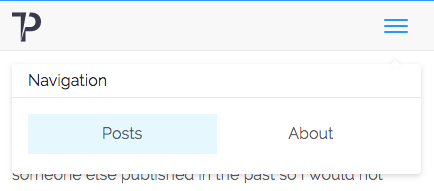
I'm including screenshots of how it may look once the viewport is narrow enough to render just the hamburger icon.

You can find a Github repo with working example here.
Hope it helps.
First a clarification: What the antd docs mean by "responsive" (in this example in the docs) is not that the navbar items reflow, but rather that the sidebar collapses into a smaller menu or disappears with a hamburger trigger button appearing.
Second: Mixing Menu and Row/Col is a bad idea. The errors are happening because Menu.Item expects to be a direct child element of Menu, and you are making it a grandchild via Row/Col, who are not passing the same props.
There is no support in AntD for your requirements as explained in your clarification. One of my AntD based sites works in a similar way to what you are looking for. What I do on that site is render two sets of menus, one for a desktop navbar and one for a small screen sidebar with hamburger, and then use CSS media queries to hide one or the other on each side of the @screen-sm breakpoint.
I was looking at this question in a decision to pick Ant design for a project. Responsive navbar is common scenario, but I was wondering why there is no such thing in Ant Design? Then I searched for issues in the repo and found the Ant Design Mobile as a comment to an issue.
They have a separate package for mobile devices. Inside Ant Design Mobile there is separate section for web components. In that section you can find a Menu component which is suitable for mobile devices hamburger icon.
Hope this will be helpful for future readers.