Android Toggle Button - Material Design
Google finally caught up with us and there's now an official toggle group in the Material library:
https://material.io/components/buttons#toggle-button
Older Post:
I've created a ToggleButton library that adheres to the Material Design guidelines:
https://github.com/rcketscientist/ToggleButtons
compile 'com.anthonymandra:ToggleButtons:2.0.0'

I am also looking for something like a ToggleButtonBar for quite some time.
Material guidelines:
I was able to achieve it abusing RadioButtons:
To achieve this single selection ButtonBar, I created a ToggleButton style for the radio buttons and created a RadioGroup.
Add this to your res/values/styles.xml:
<style name="ToggleButton" parent="@android:style/Widget.CompoundButton.RadioButton">
    <item name="android:foreground">?android:attr/selectableItemBackground</item>
    <item name="android:layout_width">match_parent</item>
    <item name="android:layout_height">32dp</item>
    <item name="android:background">@drawable/toggle_background</item>
    <item name="android:button">@null</item>
    <item name="android:paddingLeft">8dp</item>
    <item name="android:textAllCaps">true</item>
    <item name="android:paddingRight">8dp</item>
</style>
For the background ColorStateList create a res/drawable/toogle_background.xml:
<?xml version="1.0" encoding="utf-8"?>
<selector xmlns:android="http://schemas.android.com/apk/res/android">
    <item android:state_checked="true" android:state_window_focused="false">
        <color android:color="@color/toggle_hover" />
    </item>
    <item android:state_checked="false" android:state_window_focused="false">
        <color android:color="@color/toggle_normal" />
    </item>
    <item android:state_checked="true" android:state_pressed="true">
        <color android:color="@color/toggle_active" />
    </item>
    <item android:state_checked="false" android:state_pressed="true">
        <color android:color="@color/toggle_active" />
    </item>
    <item android:state_checked="true" android:state_focused="true">
        <color android:color="@color/toggle_hover" />
    </item>
    <item android:state_checked="false" android:state_focused="true">
        <color android:color="@color/toggle_normal_off" />
    </item>
    <item android:state_checked="false">
        <color android:color="@color/toggle_normal" />
    </item>
    <item android:state_checked="true">
        <color android:color="@color/toggle_hover" />
    </item>
</selector>
The append your res/values/colors.xml by:
<color name="toggle_hover">@color/gray</color>
<color name="toggle_normal">@color/gainsboro</color>
<color name="toggle_active">@color/silver</color>
<color name="toggle_normal_off">@color/darkgray</color>

<color name="gainsboro">#DCdCdC</color>
<color name="silver">#C0C0C0</color>
<color name="darkgray">#a9a9a9</color>
<color name="gray">#808080</color>
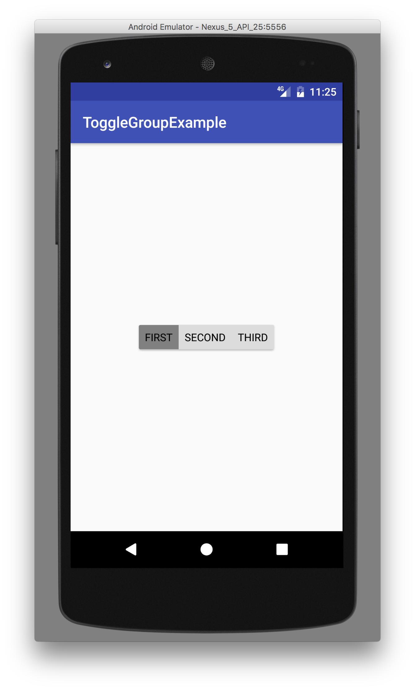
In your layout file use this code snippet, to create a material toggle button group. In my case it's the activity_main.xml
<?xml version="1.0" encoding="utf-8"?>
<LinearLayout xmlns:android="http://schemas.android.com/apk/res/android"
    xmlns:app="http://schemas.android.com/apk/res-auto"
    android:layout_width="match_parent"
    android:layout_height="match_parent"
    android:gravity="center"
    android:orientation="vertical">

    <android.support.v7.widget.CardView
        android:layout_width="wrap_content"
        android:layout_height="wrap_content"
        app:cardCornerRadius="2dp"
        app:cardElevation="2dp">

        <RadioGroup
            android:layout_width="wrap_content"
            android:layout_height="wrap_content"
            android:orientation="horizontal">

            <RadioButton
                style="@style/ToggleButton"
                android:text="First" />

            <RadioButton
                style="@style/ToggleButton"
                android:text="Second" />

            <RadioButton
                style="@style/ToggleButton"
                android:text="Third" />

        </RadioGroup>

    </android.support.v7.widget.CardView>
</LinearLayout>
I used a CardView as a wrapper for the group to achieve the rounded corners. Unfortunately on Android versions lower than Lollipop the rounded corners will result in a Padding of the CardView. You can for sure apply your own styling here with other colors or icons instead of text or both. Just create your own StateLists for those cases.
Toggle button requirements:
- Have at least three toggle buttons in a group
- Label buttons with text, an icon, or both
The following combinations are recommended:
- Multiple and unselected
- Exclusive and unselected
- Exclusive only
NOTE: for using CardView, you need to add it's dependency to your apps build.gradle file:
compile 'com.android.support:cardview-v7:25.0.1'
UPDATE: There is official support now! See the other answers below for links/usage.
Original post:
Current Library Support: No.
As of the Support Library v23.2 the current ToggleButton implementation does not behave nor is it styled as outlined in the referenced Material Design Guidelines.
Material guidelines:

Current support library styling:

Note that the buttons don't meet up together in groups surrounded by rounded borders, text is used instead of icons, and the accent color is used as an underline instead of a darkened background to indicate an 'on' status.
Is there an external library: Not yet.
I'm not aware of any defacto standard library to implement a Material ToggleButton, but there are probably a few small, barely tested ones out there, I hope? Unfortunately, Stackoverflow discourages Answers that are just links to external third-party libraries. So you'll need to search on your own, or create a custom view yourself to implement the current Material design guidelines.