Alert Dialog with Rounded corners in flutter
The container where you set the BoxDecoration is in the widget tree under the alert dialog. Which means you are setting just a box within the padding of your Dialog. You need to create a custom AlertDialog/showDialog and set the radius there. In the custom widget you also add the button and everything where you need to work beyond that padding.
When you include the customShowDialog.dart file in your project (gist.github.com) where you can edit the radius here borderRadius: BorderRadius.all(Radius.circular(20.0)) and call it like this:
return new CustomAlertDialog(
    content: new Container(
        width: 260.0,
        height: 230.0,
        decoration: new BoxDecoration(
        shape: BoxShape.rectangle,
        color: const Color(0xFFFFFF),
        borderRadius:
            new BorderRadius.all(new Radius.circular(32.0)),
        ),
        child: new Column(
        crossAxisAlignment: CrossAxisAlignment.stretch,
        children: <Widget>[
            // dialog top
            new Expanded(
            child: new Row(
                children: <Widget>[
                new Container(
                    // padding: new EdgeInsets.all(10.0),
                    decoration: new BoxDecoration(
                    color: Colors.white,
                    ),
                    child: new Text(
                    'Rate',
                    style: TextStyle(
                        color: Colors.black,
                        fontSize: 18.0,
                        fontFamily: 'helvetica_neue_light',
                    ),
                    textAlign: TextAlign.center,
                    ),
                ),
                ],
            ),
            ),

            // dialog centre
            new Expanded(
            child: new Container(
                child: new TextField(
                decoration: new InputDecoration(
                border: InputBorder.none,
                filled: false,
                contentPadding: new EdgeInsets.only(
                    left: 10.0,
                    top: 10.0,
                    bottom: 10.0,
                    right: 10.0),
                hintText: ' add review',
                hintStyle: new TextStyle(
                    color: Colors.grey.shade500,
                    fontSize: 12.0,
                    fontFamily: 'helvetica_neue_light',
                ),
                ),
            )),
            flex: 2,
            ),

            // dialog bottom
            new Expanded(
            child: new Container(
                padding: new EdgeInsets.all(16.0),
                decoration: new BoxDecoration(
                color: const Color(0xFF33b17c),
                ),
                child: new Text(
                'Rate product',
                style: TextStyle(
                    color: Colors.white,
                    fontSize: 18.0,
                    fontFamily: 'helvetica_neue_light',
                ),
                textAlign: TextAlign.center,
                ),
            ),
            ),
        ],
        ),
    ),
    );
});
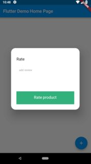
You will get something like this:
EDIT:
Although Flutter lately introduced the shape property which would help you with the rounded corners by setting a ShapeBorder with e.g.
shape: RoundedRectangleBorder(
    borderRadius: BorderRadius.all(Radius.circular(20.0))
),
you would still need to quickly add a custom widget for some customizations, like custom padding, as stated above.
Though i am late with the solution, but this may help others searching for it. The following code snippets details how it can be achieved.
import 'package:flutter/material.dart';

void main() => runApp(MyApp());
Color myColor = Color(0xff00bfa5);

class MyApp extends StatelessWidget {
  @override
  Widget build(BuildContext context) {
    return MaterialApp(
      debugShowCheckedModeBanner: false,
      title: "Rounde Alert Box",
      home: Scaffold(
        appBar: AppBar(
          backgroundColor: myColor,
          title: Text("Rounded Alert Box"),
        ),
        body: RoundedAlertBox(),
      ),
    );
  }
}

class RoundedAlertBox extends StatefulWidget {
  @override
  _RoundedAlertBoxState createState() => _RoundedAlertBoxState();
}

class _RoundedAlertBoxState extends State<RoundedAlertBox> {
  @override
  Widget build(BuildContext context) {
    return Center(
      child: RaisedButton(
        onPressed: openAlertBox,
        color: myColor,
        child: Text(
          "Open Alert Box",
          style: TextStyle(color: Colors.white),
        ),
      ),
    );
  }

  openAlertBox() {
    return showDialog(
        context: context,
        builder: (BuildContext context) {
          return AlertDialog(
            shape: RoundedRectangleBorder(
                borderRadius: BorderRadius.all(Radius.circular(32.0))),
            contentPadding: EdgeInsets.only(top: 10.0),
            content: Container(
              width: 300.0,
              child: Column(
                mainAxisAlignment: MainAxisAlignment.start,
                crossAxisAlignment: CrossAxisAlignment.stretch,
                mainAxisSize: MainAxisSize.min,
                children: <Widget>[
                  Row(
                    mainAxisAlignment: MainAxisAlignment.spaceEvenly,
                    mainAxisSize: MainAxisSize.min,
                    children: <Widget>[
                      Text(
                        "Rate",
                        style: TextStyle(fontSize: 24.0),
                      ),
                      Row(
                        mainAxisSize: MainAxisSize.min,
                        children: <Widget>[
                          Icon(
                            Icons.star_border,
                            color: myColor,
                            size: 30.0,
                          ),
                          Icon(
                            Icons.star_border,
                            color: myColor,
                            size: 30.0,
                          ),
                          Icon(
                            Icons.star_border,
                            color: myColor,
                            size: 30.0,
                          ),
                          Icon(
                            Icons.star_border,
                            color: myColor,
                            size: 30.0,
                          ),
                          Icon(
                            Icons.star_border,
                            color: myColor,
                            size: 30.0,
                          ),
                        ],
                      ),
                    ],
                  ),
                  SizedBox(
                    height: 5.0,
                  ),
                  Divider(
                    color: Colors.grey,
                    height: 4.0,
                  ),
                  Padding(
                    padding: EdgeInsets.only(left: 30.0, right: 30.0),
                    child: TextField(
                      decoration: InputDecoration(
                        hintText: "Add Review",
                        border: InputBorder.none,
                      ),
                      maxLines: 8,
                    ),
                  ),
                  InkWell(
                    child: Container(
                      padding: EdgeInsets.only(top: 20.0, bottom: 20.0),
                      decoration: BoxDecoration(
                        color: myColor,
                        borderRadius: BorderRadius.only(
                            bottomLeft: Radius.circular(32.0),
                            bottomRight: Radius.circular(32.0)),
                      ),
                      child: Text(
                        "Rate Product",
                        style: TextStyle(color: Colors.white),
                        textAlign: TextAlign.center,
                      ),
                    ),
                  ),
                ],
              ),
            ),
          );
        });
  }
}
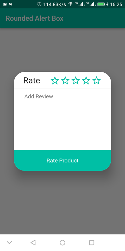
The output of the code snippet looks like this: