Alert controller input box validation
The solution using a toast is completely valid, but from the perspective of UX I find it splits the focus of the user too much to have an open alert and be messaging form errors through toasts.
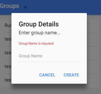
Instead, I like to append the validations to the DOM of the alert. This example is a simple alert with a single input, but could be easily extended with some util methods to create the validation boilerplate. I also created the example in a quick stackblitz. In my case I already include a variant of the validation errors markup throughout the application so the styles are already global, and I just need to introduce the markup to have it styled.
const alert = await this.alertController.create({
  header: 'Example Header',
  subHeader: 'Example Subheader',
  message: 'Lorem ipsum dolor sit amet consectetur adipisicing elit.',
  backdropDismiss: false,
  cssClass: 'example-alert',
  inputs: [
    {
      type: 'text',
      name: 'mobilePhone',
      label: 'Mobile Phone',
      placeholder: 'Mobile phone (10 digits)',
      attributes: {
        maxlength: 10
      }
    }
  ],
  buttons: [
    {
      text: 'Ok',
      handler: (formData: { mobilePhone: string }) => {
        if (formData.mobilePhone && PhoneValidator.isValid(formData.mobilePhone))
          return formData;
        } else {
          // Only if no validation has been inserted into the DOM
          if (!alert.getElementsByClassName('validation-errors').length) {
            const input = alert.getElementsByTagName('input')[0];

            const validationErrors = document.createElement('div');
            validationErrors.className = 'validation-errors';

            const errorMessage = document.createElement('small');
            errorMessage.classList.add('error-message');
            errorMessage.textContent = 'Invalid phone number';

            validationErrors.appendChild(errorMessage);

            input.insertAdjacentElement('afterend', validationErrors);
          }

          return false;
        }
      }
    }
  ]
});

await alert.present();
.validation-errors {
  padding-top: 5px;
  text-align: left;

  .error-message {
    color: var(--ion-color-danger);
    font-size: 12px;
  }
}

// Example of markup:
//<div class="validation-errors">
//  <small class="error-message"></small>
//</div>
At this moment this feature has not been implemented.You can see this Git issue.
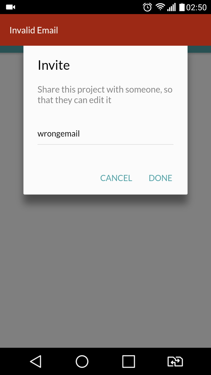
I have used Toast notification here and I didn't get any complaint about it from my client :)
Here is what I have done.
alert boxe's done handler:
{
          text: 'Done',
          handler: (data) => {
            if (EmailValidator.isValid(data.email)) {
              if (this.data) {
                //my code
              } else {
                //my code
              }
              return true;
            } else {
              this.showErrorToast('Invalid Email');
              return false;
            }
          }
        }
Toast method is like this:
showErrorToast(data: any) {
    let toast = this.toastCtrl.create({
      message: data,
      duration: 3000,
      position: 'top'
    });

    toast.onDidDismiss(() => {
      console.log('Dismissed toast');
    });

    toast.present();
  }
UI
I did find a work around by using setMessage method. Initially message will be empty and when user has not entered any value the validation message will be filled up on click. Find the code snippet below
let prompt = Alert.create({
  title: 'Alert input validation',
  message: '',
  inputs: [
    {
      name: 'email',
      placeholder: 'email'
    },
  ],
  buttons: [
    {
      text: 'Save',
      handler: data => {
                    let validateObj = this.validateEmail(data);
                    if (!validateObj.isValid) {
                        prompt.setMessage('Your validation message');
                        return false;
                    } else {
                        //make HTTP call
                    }
                }
    }
  ]
});
You can override the font of message in variable.scss file as below
$alert-md-message-text-color:red;