Adding custom radio buttons in android
I have updated accepted answer and removed unnecessary things.
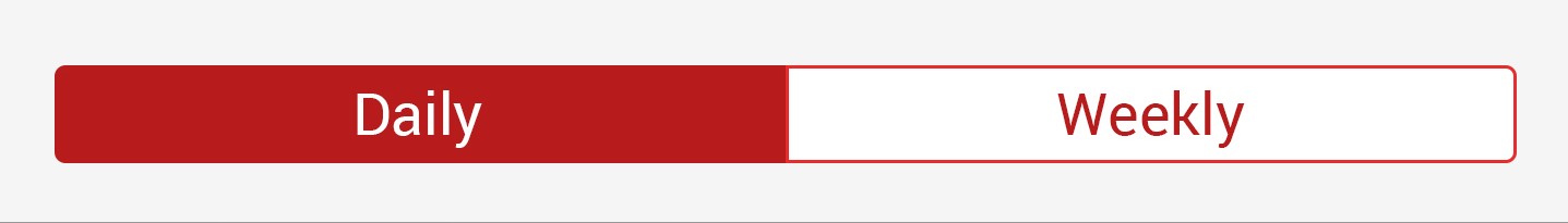
I have created XML for following image.
Your XML code for RadioButton will be:
<RadioGroup
        android:id="@+id/daily_weekly_button_view"
        android:layout_width="match_parent"
        android:layout_height="wrap_content"
        android:layout_marginStart="8dp"
        android:layout_marginLeft="8dp"
        android:layout_marginTop="8dp"
        android:layout_marginEnd="8dp"
        android:layout_marginRight="8dp"
        android:gravity="center_horizontal"
        android:orientation="horizontal"
        app:layout_constraintEnd_toEndOf="parent"
        app:layout_constraintStart_toStartOf="parent"
        app:layout_constraintTop_toTopOf="parent">


        <RadioButton
            android:id="@+id/radio0"
            android:layout_width="@dimen/_80sdp"
            android:gravity="center"
            android:layout_height="wrap_content"
            android:background="@drawable/radio_flat_selector"
            android:button="@android:color/transparent"
            android:checked="true"
            android:paddingLeft="@dimen/_16sdp"
            android:paddingTop="@dimen/_3sdp"
            android:paddingRight="@dimen/_16sdp"
            android:paddingBottom="@dimen/_3sdp"
            android:text="Daily"
            android:textColor="@color/radio_flat_text_selector" />

        <RadioButton
            android:id="@+id/radio1"
            android:gravity="center"
            android:layout_width="@dimen/_80sdp"
            android:layout_height="wrap_content"
            android:background="@drawable/radio_flat_selector"
            android:button="@android:color/transparent"
            android:paddingLeft="@dimen/_16sdp"
            android:paddingTop="@dimen/_3sdp"
            android:paddingRight="@dimen/_16sdp"
            android:paddingBottom="@dimen/_3sdp"
            android:text="Weekly"
            android:textColor="@color/radio_flat_text_selector" />

</RadioGroup>
radio_flat_selector.xml for background selector:
<?xml version="1.0" encoding="utf-8"?>
<selector xmlns:android="http://schemas.android.com/apk/res/android">
    <item android:drawable="@drawable/radio_flat_selected" android:state_checked="true" />
    <item android:drawable="@drawable/radio_flat_regular" />
</selector>
radio_flat_selected.xml for selected button:
<?xml version="1.0" encoding="utf-8"?>
<shape xmlns:android="http://schemas.android.com/apk/res/android"
    android:shape="rectangle">
    <corners
        android:radius="1dp"
        />
    <solid android:color="@color/colorAccent" />
    <stroke
        android:width="1dp"
        android:color="@color/colorAccent" />
</shape>
radio_flat_regular.xml for regular selector:
<?xml version="1.0" encoding="utf-8"?>
<shape xmlns:android="http://schemas.android.com/apk/res/android"
    android:shape="rectangle">
    <corners android:radius="1dp" />
    <solid android:color="#fff" />
    <stroke
        android:width="1dp"
        android:color="@color/colorAccent" />
</shape>
All the above 3 file code will be in drawable/ folder.
Now we also need Text Color Selector to change color of text accordingly.
radio_flat_text_selector.xml for text color selector
(Use color/ folder for this file.)
<?xml version="1.0" encoding="utf-8"?>
<selector xmlns:android="http://schemas.android.com/apk/res/android">
    <item android:color="@color/colorAccent" android:state_checked="false" />
    <item android:color="@color/colorWhite" android:state_checked="true" />
</selector>
Note: I refereed many answers for this type of solution but didn't found good solution so I make it.
Hope it will be helpful to you.
Thanks.
Use the same XML file format from Evan's answer, but one drawable file is all you need for formatting.
<RadioButton
    android:id="@+id/radio0"
    android:layout_width="wrap_content"
    android:layout_height="wrap_content"
    android:background="@drawable/custom_button_background"
    android:button="@android:color/transparent"
    android:checked="true"
    android:text="RadioButton1" />
And your separate drawable file:
<?xml version="1.0" encoding="utf-8"?>
<selector xmlns:android="http://schemas.android.com/apk/res/android" >

    <item android:state_pressed="true" >
         <shape android:shape="rectangle" >
             <corners android:radius="3dip" />
             <stroke android:width="1dip" android:color="#333333" />
             <solid android:color="#cccccc" />
         </shape>
    </item>

    <item android:state_checked="true">
         <shape android:shape="rectangle" >
             <corners android:radius="3dip" />
             <stroke android:width="1dip" android:color="#333333" />
             <solid android:color="#cccccc" />
         </shape>
    </item>

    <item>
         <shape android:shape="rectangle"  >
             <corners android:radius="3dip" />
             <stroke android:width="1dip" android:color="#cccccc" />
             <solid android:color="#ffffff" />
         </shape>
    </item>
</selector>
Add a background drawable that references to an image, or a selector (like below), and make the button transparent:
<RadioButton
    android:id="@+id/radio0"
    android:layout_width="wrap_content"
    android:layout_height="wrap_content"
    android:background="@null"
    android:button="@drawable/yourbuttonbackground"
    android:checked="true"
    android:text="RadioButton1" />
If you would like your radio buttons to have a different resource when checked, create a selector background drawable:
res/drawable/yourbuttonbackground.xml
<selector xmlns:android="http://schemas.android.com/apk/res/android" >
    <item
        android:drawable="@drawable/b"
        android:state_checked="true"
        android:state_pressed="true" />
    <item
        android:drawable="@drawable/a"
        android:state_pressed="true" />
    <item
        android:drawable="@drawable/a"
        android:state_checked="true" />
    <item
        android:drawable="@drawable/b" />
</selector>
In the selector above, we reference two drawables, a and b, here's how we create them:
res/drawable/a.xml - Selected State
<shape
    xmlns:android="http://schemas.android.com/apk/res/android"
    android:shape="rectangle" >
    <corners
        android:radius="5dp" />
    <solid
        android:color="#fff" />
    <stroke
        android:width="2dp"
        android:color="#53aade" />
</shape>
res/drawable/b.xml - Regular State
<shape
    xmlns:android="http://schemas.android.com/apk/res/android"
    android:shape="rectangle" >
    <corners
        android:radius="5dp" />
    <solid
        android:color="#fff" />
    <stroke
        android:width="2dp"
        android:color="#555555" />
</shape>
More on drawables here: http://developer.android.com/guide/topics/resources/drawable-resource.html