Add stroke around text - on the outside - with css?
One option is to use text-shadow to simulate a stroke. Example:
text-shadow:
    -1px -1px 0 #000,
     1px -1px 0 #000,
    -1px  1px 0 #000,
     1px  1px 0 #000;
The -webkit-text-stroke doesn't support placing the stroke on the outside of the text
as this CSS-Tricks article explains:
The stroke drawn by text-stroke is aligned to the center of the text shape (as is the default in Adobe Illustrator), and there is currently no option to set the alignment to the inside or outside of the shape. Unfortunately this makes it much less usable, as no matter what now the stroke interferes with the shape of the letter destroying the original type designers intent. A setting would be ideal, but if we had to pick one, outside stroke would have been much more useful.
What about SVG?
Well it seems that it also places the stroke on the inside -
FIDDLE
However,
you might be able to simulate this effect (depending on what you need) by:
Change your font to a sans serif like verdana and
Increase the font-size of the text you are adding a stroke to.
body {
  background: grey;
  font-family: verdana;
}
.stroke,
.no-stroke {
  color: white;
  font-size: 2.5em;
}
.stroke {
  -webkit-text-stroke: 2px black;
   font-size: 2.7em;
}
<h1 class="stroke">WHAT CAREER SHOULD YOU HAVE?</h1>
<h1 class="no-stroke">WHAT CAREER SHOULD YOU HAVE?</h1>Firefox and Safari now support a new CSS property called paint-order which can be used to simulate an outside stroke:
h1 {
color: #00ff01;
font-size: 3em;
-webkit-text-stroke: 5px black;
}
.fix-stroke {
paint-order: stroke fill;
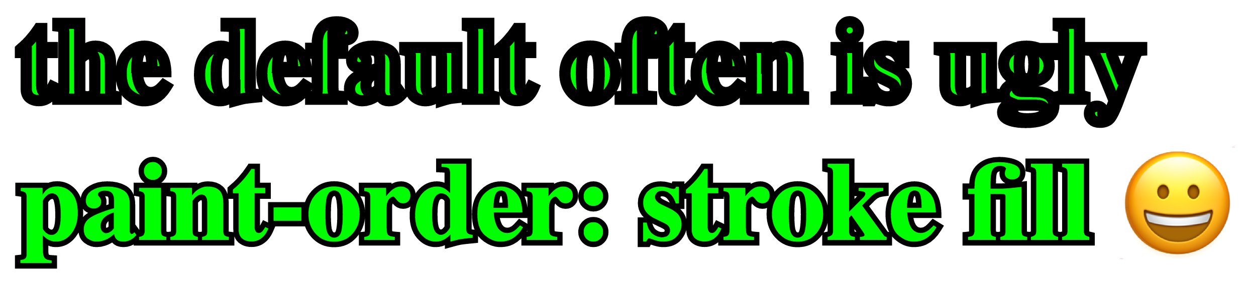
}<h1>the default often is ugly</h1>
<h1 class="fix-stroke">paint-order: stroke fill ð</h1>Screenshot:
For a smooth outside stroke emulated by text shadow, use the following 8-axis shadow:
  text-shadow:
    -1px -1px 0 #000,
     0   -1px 0 #000,
     1px -1px 0 #000,
     1px  0   0 #000,
     1px  1px 0 #000,
     0    1px 0 #000,
    -1px  1px 0 #000,
    -1px  0   0 #000;
For customisation, you can use this SASS mixin instead (although changing the size does have side effects on rendering):
@mixin stroke($color: #000, $size: 1px) {
  text-shadow:
    -#{$size} -#{$size} 0 $color,
     0        -#{$size} 0 $color,
     #{$size} -#{$size} 0 $color,
     #{$size}  0        0 $color,
     #{$size}  #{$size} 0 $color,
     0         #{$size} 0 $color,
    -#{$size}  #{$size} 0 $color,
    -#{$size}  0        0 $color;
}
This gives a very smooth stroke, without missing parts, like on the 4 axis solution.