Add a border with cornerRadius to an Image in SwiftUI Xcode beta 5
SwiftUI 1.0
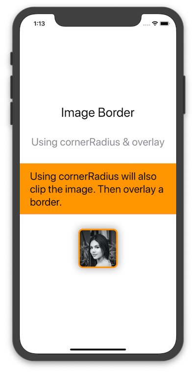
Using cornerRadius & overlay Modifiers
Here is another way in which we can use a cornerRadius modifier (which clips the view) and then overlay a stroke with a color.
VStack(spacing: 40) {
    Text("Image Border").font(.largeTitle)
    Text("Using cornerRadius & overlay").font(.title).foregroundColor(.gray)
    Text("Using cornerRadius will also clip the image. Then overlay a border.")
        .frame(minWidth: 0, maxWidth: .infinity)
        .font(.title)
        .padding()
        .background(Color.orange)
        .foregroundColor(.black)

    Image("profile")
        .cornerRadius(10)
        .overlay(RoundedRectangle(cornerRadius: 10)
            .stroke(Color.orange, lineWidth: 4))
        .shadow(radius: 10)
}
Result
First, note that the way you were doing it, was not clipping the image. Maybe you did not noticed if the image was too small, or if it had a background of the same color of your canvas. But even while using your beta 4 syntax, you needed to add .clipShape().
Back to your question, according to Beta 5 release notes:
Complex overloads for the background(:alignment:) and border(:width:) modifiers are deprecated. Use shapes in a background(:alignment:) or overlay(:alignment:) to draw these instead. (53067530)
So the pattern would be something like this:
.overlay(RoundedRectangle(...).stroke(...).foregroundColor(...))
In your specific case:
Image("mypic").resizable().frame(width: 300, height: 300)
    .clipShape(RoundedRectangle(cornerRadius: 30))
    .overlay(RoundedRectangle(cornerRadius: 30).stroke(lineWidth: 2).foregroundColor(Color.black))
Consider this: adding a modifier to a view will return a new View instance that wraps the previous instance. This is also why the order in which you add modifiers matters.
We can use this to our advantage: by adding a padding, then adding a background to our new View, we can create our own additional layers:
Image("cat")
    .cornerRadius(7) // Inner corner radius
    .padding(5) // Width of the border
    .background(Color.primary) // Color of the border
    .cornerRadius(10) // Outer corner radius
Results in:

You can even turn this in a ViewModifier to be reusable more easily:
struct RoundedEdge: ViewModifier {
    let width: CGFloat
    let color: Color
    let cornerRadius: CGFloat

    func body(content: Content) -> some View {
        content.cornerRadius(cornerRadius - width)
            .padding(width)
            .background(color)
            .cornerRadius(cornerRadius)
    }
}
Using it would become:
Image("cat").modifier(RoundedEdge(width: 5, color: .black, cornerRadius: 20))
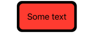
This workd for any SwiftUI View, like Text:
Text("Some text")
    .padding(15)
    .background(Color.red)
    .modifier(RoundedEdge(width: 5, color: .black, cornerRadius: 20))
Results in: